Planning:
The next step in my symbolism study is my mock exam. This is the final thing I will produce in my symbolism work and stems from my Personal Study ideas based on Fairy Tales and Narrative.
Venn Diagram
To begin planning this I looked at two of my most influential artists and have compared them in a venn diagram below. The two artists I chose were Annie Leibovitz and Helen Oxenbury both artists which I have focused on throughout my coursework. Annie Leibovitz is the artist on the bottom Helen Oxenbury is the artist at the top.
I like both of these artists and feel they have interesting artistic qualities within their work. From this venn diagram I found the parts I liked best were:
- The use of illustrations - could use Adobe Illustrator for outline then Photoshop for colour
- The theme of Alice in Wonderland
- Representing the darker side of fairy tales
- Creating a bizarre and surreal piece of artwork
- Using an adult/teenage model
Brainstorming
Incorporating the theme of Alice in Wonderland into my work means I need to look slightly deeper into this narrative. Below is a interactive 'brain vomit' made through Prezi.com which explores some key themes and ideas from this narrative.Mood Board
Now I have a deeper understanding of Alice in Wonderland as well as having decided on the concept of work I would like to produce I know need to work on what to produce. In order to come up with some initial ideas I have looked at how other artists have shows this narrative within their own work. I typed to words 'Alice in Wonderland Artwork' into Google Images and below are the artworks which I found inspiring:Initial Ideas
Taking into account all the research from above I now need to develop some ideas for the mock exam. Below is another mood board however this incorporates some more direct ideas. It features images which I found influential from the mood board above as well as some key concepts which I liked from my venn diagram and brainstorm.Initial Ideas
Taking into account the ideas from my mood boards above and my research I need to now begin creating some ideas. Below is a 'brain vomit' of rough ideas and concepts which I could develop when creating my Mock Exam response. I have split it into three sections each focusing on a different media. However some ideas are cross linked show through the arrows going from an idea to the other media title.
I have drawn up these ideas below as quick thumbnail images to try and understand how I think they should look. The number next to the idea corresponds to the number next to the drawing.
Further Research
As my initial ideas all focus on Alice in Wonderland I have decided to investigate this story further. I also need to look at some inspirational artists, I found three artists which create work similar to my own initial ideas; book dioramas and set designs. Which are things I haven't yet investigated, however I am not dismissing my other ideas I have just already researched these ideas in previous work. Research on Alice in Wonderland, Lewis Carroll and Victorian Literature.
Alice in WonderlandI went on the website: http://www.sparknotes.com/lit/alice/themes.html. I found the key themes and motifs incredibly useful in analysing the story. Below are the notes I made from this.
Themes
The Tragic and Inevitable Loss of
Childhood Innocence
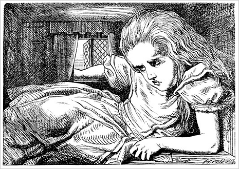 Alice goes through a variety of physical changes. Most key is when she
shrinks and grows. The discomfort she feels at never being the right size
mirrors the changes occurring during puberty. She struggles to maintain a
comfortable size and often feels discomfort and frustration. These represent
the way children may feels as the grow up.
I feel this adds another level to this story and it helps younger people
try to understand the changes they go through as they get older. This is
something I could mirror in my own work as I could use a child model and a
teenage model then a adult model to show the changes of a person through time.
Death as a Constant and Underlying
Menace
Many situations in Alice in Wonderland represent death and it appears often
with Alice risking her life in situations with she never contemplates the
outcomes. The main representation is “Off with it’s head!” a key quotation from
the Queen when she threatens the people of Wonderland.
This is something I feel could be mirrored through the use of dark
lighting and creating an ominous tone through contrasting a light section with
a dark section.
Motifs
Dreams
Characters and events are mixture between real world and dream world. It
explains the abundance of nonsensical and disparate events in the story. The
narrative follows the dreamer as she encounters various events.
I feel to display this dreamlike quality I could apply a dust effective
over the image and so you can’t see the image clearly.
Curious, Nonsense and Confusing
The events Alice encounters are often referred to as Curious and
Confusing. She declares many things as nonsense and tries to gain a clearer
picture of how the experiences function in the world of Wonderland.
I feel this could be something fun to experiment with so I can play
around with ideas of pure nonsense and link it back to my work on DADA and
produce work similar to that.
Symbols
The Garden
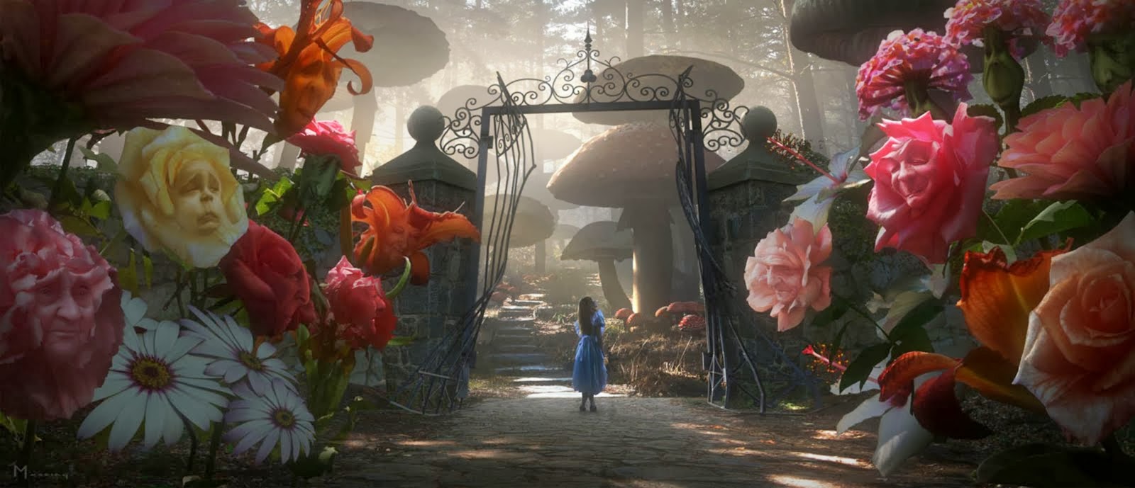 The garden may symbolize the Garden of Eden, an idyllic space of beauty
and innocence which Alice in not permitted to enter. The garden may also
represent experiencing desire and Alice focuses her energy and emotions on
trying the gain this. Previously I have looked at temptations and playing around with the idea
of giving into desire. I therefore may develop this further and work with how
the Garden of Eden can work with this.
The Caterpillar’s Mushroom
The mushroom has many meanings, some say it’s a sexual threat and a
symbol of sexual virginity. Alice must master the properties of the mushroom to
gain control over her size. Others view it as a psychedelic hallucinogen which
compounds surreal and distorted perceptions of Wonderland. I feel I can show this by using the mushroom continually and in a key
way. I will use the image of a Caterpillar and Mushroom as possibly a key
symbol in controlling the events of the images.
Lewis Carroll
It is rumored Lewis Carroll was a drug addict when he wrote the story which would explain how he developed this bizarre and weird alternative world. However I couldn't find any evidence to back up this theory. I did find however, that the character Alice was based on a real girl. Using the website: http://www.aliceinwonderlandshop.co.uk/history.html. Alice Liddell was the daughter of the Dean of Christ Church College at Oxford which was the base of the novel. He wrote the book and was encouraged to publish it after it was read by Alice Liddel's father.
Victorian Literature
Inspirational Artists
Now I have done some further research I am going to look at key artists which produce work reflecting Alice in Wonderland in the style of Set Design and Book Dioramas.
Su Blackwell and Thomas Allen both produce Book Dioramas but in different ways. Below are two mood boards presenting their work.
As they both produce work with the same theme but in different ways I have produced a Venn Diagram comparing and contrasting these two artists.
Another way of representing Alice in Wonderland which I found interesting was set designs and producing a set design which Alice in Wonderland would be shown on. Bob Crowley is an artist which I found when I watched the ballet of this story. He produced set designs which captivates the audience and transports them into the weird and wonderful world of Wonderland. Below are images of his work.
Developed Ideas
Taking on board the further research I have done I will now create another ideas brainstorm but this time more refined with in depth ideas. I have done this on Prezi.com. Click on the post-it notes to zoom into them to read it then double click to zoom back out.
I began by drawing out two images, one of 'Alice' and one of 'The Caterpillar'. I drew them on plain paper then using a pencil held it against the book and pressed hard on the page so it imprinted onto the page making it easier to draw onto the book.
Then using a craft knife I cut out the two shapes from the book once I had re drawn them onto the page. I then placed the book in a box which I covered with a bin bag to make it have a black background and then photographed the installation focuses on using depth of field.
I didn't have a lot of professional make up therefore had to use basics which I already had. I took the photographs against a plain background and posed the models in typical beauty shots which also reflected their characters.
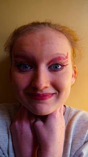 On the left is the original photo I took. I feel the make up isn't as prominent as I hoped due to it being too subtle and for the character of the Chesire Cat it needs to be over the top. However the position works well, as the Chesire Cat's usually headless as he can disappear I have positioned her hands over the neck to almost hide the neck. Also she has a large smile and bright eyes replicating the character. On the left is a edited version of the image which I adjusted in Photoshop. I changed the vibrancy, colour balance and levels as I want to make it slightly more editorial by highlighting the lighting and then I wanted to make the purple make-up stand out more.
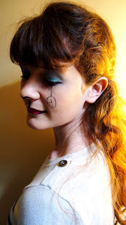 On the left is the original photo I took. This is one of my favourite photographs of this idea as it's obvious who she is put doesn't over power you. It's subtly adds to the beauty of the piece. However there is an issue with the make-up itself as her foundation doesn't match her skin tone which makes her look like she has an odd skin tone. I have positioned her in this way as the White Rabbit beckons Alice into Wonderland and with the girl twisting her body it looks like she has turned to face the Alice to follow her. Making her look down means you look at the make-up around her eye rather than her eye itself. I have edited this picture by simply accentuating the lighting as I like how it develops within the image. The edited picture is on the right.
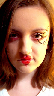 On the left is the original photo I took. I feel this is another good look as it links to the character of the Red Queen without being too over the top. I made the model have messy hair and look directly at the camera to show she doesn't care and almost is angry reflecting the character itself. However the card is good but would be better if it was a red card with a heart on it as she is the Queen of Hearts. Therefore next time I do it this could be something to work on. I captured this up close as when I researched beauty photography many photographers captured up close photos which I feel look very effective as well it minimizes the background which could distract. I edited this in a simpler way compared to the others as I already liked it so I just adjusted the levels and curves to make it brighter as well as adding hints of red.
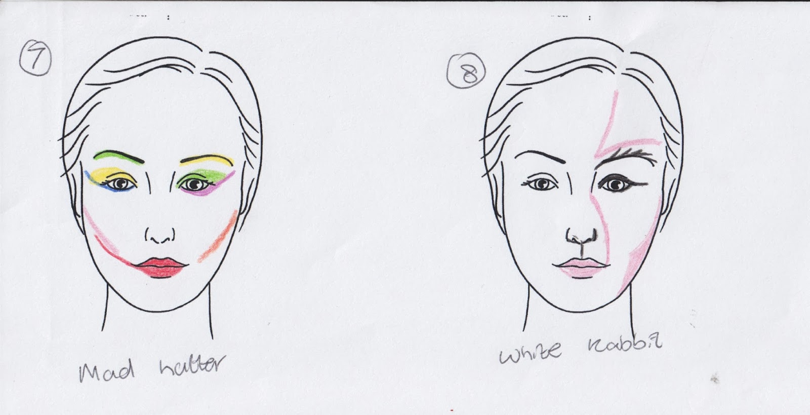
From these ideas I have decided to re-create:
Number 1 for the White Rabbit - I chose this idea as I have done it previously and it worked very well. I have developed it by adding spots around the nose and mouth to make it look more like an animal.
Number 2 for the Red Queen - I chose this as one again it is similar to the idea I have done previously for this character but I have developed it. I kept the card idea but changed the suit on the card. Also I moved the heart to the side of the mouth as I found the nose didn't allow to clearly show off that it was a heart on her lips. I also added a blue eyeshadow around the eye as previously I used pink and it didn't show as clearly.
Number 5 for the Chesire Cat - I chose this as last time I found it wasn't obvious enough and didn't allow the viewer to truly understand the character the model was imitating. The mouth of the Chesire Cat is his most significant feature so I feel re-creating this will help highlight the character.
Number 7 for the Mad Hatter - I have added in this character as I felt three was an odd number and now I have two human characters and two animal characters which I could experiment with. I found the Mad Hatter most difficult so decided to just use bright colours throughout the make-up and make the model look bizarre. When photographing I will ask the model to hold a teacup or have a top hat to clearly show the character.
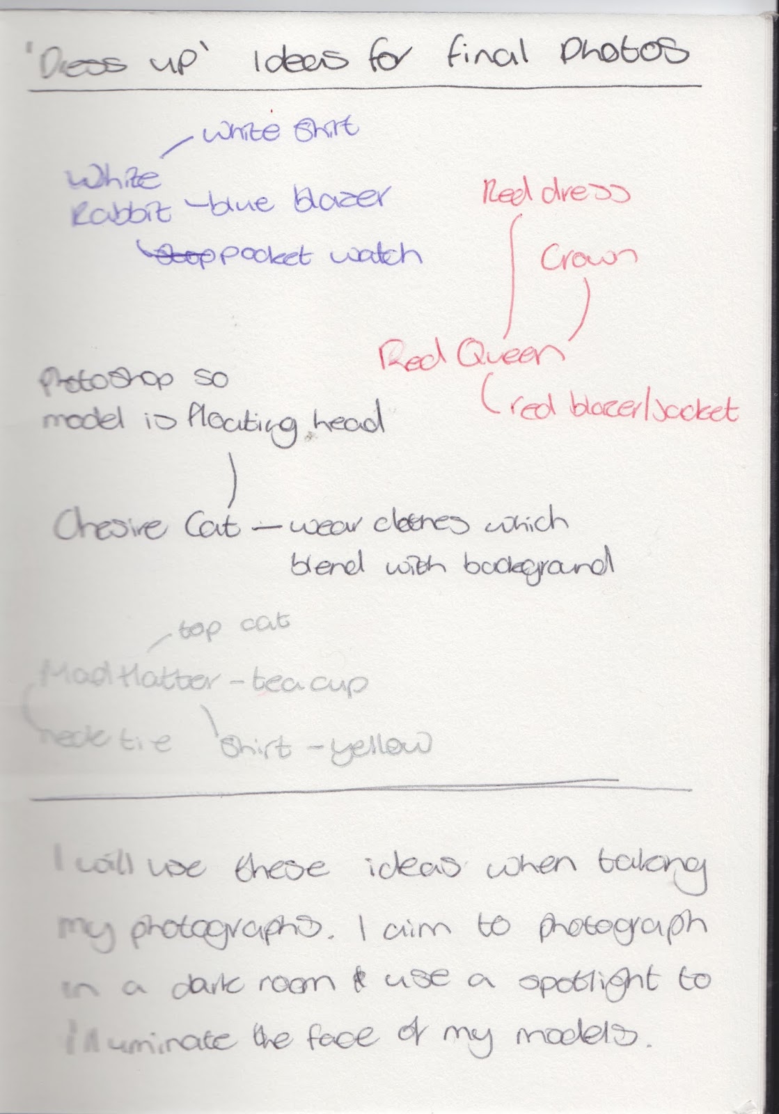 I found last time when I was photographing having my models dressed in ordinary clothing lost the 'magic' of the piece. Therefore I plan to 'dress them up' as the characters from the story. Below is a brainstorm of ideas which I could use when creating my photographs based on the four characters I plan my models to illuminate.
Of the mock-up photographs I found I liked the fourth one with the book fully open the best. It allowed room for all the characters to be seen. However, after doing this I wasn't overly keen on this idea after all. I found it didn't work out how I liked it. One the images had been printed they lost some of their quality then when they were re-photographed they lost more quality. Therefore I feel this is a bad idea and won't continue on with it. This does mean though, I know need to develop a new way of presenting my final photographs. I still want to do something which relates to books an specifically the book of Alice in Wonderland.
I took an image from my previous test shoot for this idea and began the process. I have followed the steps on the tutorial exactly and below are the screen shots of this process.
This was my final outcome. I like the craziness of this image and it links to the ideas of Lewis Carroll being influenced by drugs and the effect they give you. It also links to the distorted nature of Alice in Wonderland. As well it is another way in which you can present Fairy Tales without being too direct which I something I focused on within my Personal Study. However, I wanted to test if I could interlace different images with one another and see what effect this gave. Therefore, again using a image from my previous shoot of the 'White Rabbit' I experimented again. Below are the screen shots of this process:
On the left is my final outcome. I found this idea worked well, it was very interesting and meant I didn't have to make a kaleidoscope but rather use effects and do it myself through effects. For the exam I will try a different tutorial online as by doing some further research I found some more tutorials which make the effect look slightly better than this one. However I do still like the idea of doing a physical kaleidoscope and therefore I will still experiment with this idea.
If I could re do my work again I would definitely change my kaleidoscope idea. I was happy with the wrap I placed on it but other than that it was of very poor quality. I would work on my sizes more to ensure they were the correct size for the tube and then I would also ensure the laser cuttings were correct size to fit into the tube. I would also change the Cheshire Cat image as although the floating head works it doesn't look as real as the other images therefore I would re-photograph by photographing the backdrop with the exact same lighting as that which I would use for my model and work on overlapping the images.
Idea 1
My first idea was to produce a book installation in the style of Su Blackwell and photograph it in the style of Thomas Allen.
Then using a craft knife I cut out the two shapes from the book once I had re drawn them onto the page. I then placed the book in a box which I covered with a bin bag to make it have a black background and then photographed the installation focuses on using depth of field.
I like both of these photographs and the concepts they are based on. I feel it mirrors Su Blackwell's work well however it's not my favourite idea. I would prefer to use my own photography as well rather than drawing objects. Therefore if I take this idea further I could perhaps use photographs and stick them into the book - like the work of Thomas Allen and experiment with that idea. Therefore I could look back at my Paris Response piece and produce work similar to that but in this style - using photographs as a pop up but placing them into a book.
Idea 2
My second idea is to produce a set design which reflects Alice in Wonderland and could be used in a performance of the story. However as this is a trial I want to create a digital set design and focus on the backdrop rather than the stage itself. Therefore I need to research this, I have already researched this idea with the artist Bob Crowley but he produces whole sets whereas I want to produce backdrops. Below is a mood board it combines backdrops to Alice in Wonderland productions and other images which relate too: Garden of Eden, Temptations of Alice in Wonderland and Card Decks.
Based on the mood board above I now plan to create my own backdrop. To begin with I drafted it up on paper:
Next I need to draw it up digitally. I am going to use this image as a base and using Adobe Illustrator I plan on creating it digitally. I used a round brush to get smooth lines and used a variety of brush strokes:
The above image is how it looked once I had drawn it in Illustrator. I like the topsy-turvy nature of this piece, it's a bit different and the lack of sense reflects the confusion Alice feels within this world. However it does need colour to bring the piece to life. Therefore I will now take it into Photoshop and add colour through brush strokes and change the darkness of the colour to add elements of shade.
I like the childlike nature of this illustration, it reflects work which I have looked at well. However, I don't feel this is a sufficient piece for my mock exam though. It's slightly poor quality and doesn't fully represent Alice in Wonderland in a way which I would like it to be portrayed. I do feel the brightness helps emit a happy feeling as when viewers observe it they will thing positively about this image. It doesn't reflect the idea of a set design backdrop which it should do so therefore I feel I should cut this idea.
Idea 3
My final idea was to photograph models with make up on which depict key characters from Alice in Wonderland. I chose the characters of: The Chesire Cat, The White Rabbit and The Red Queen. I chose them as personally when I read the book I loved these characters and I want my work to be personal and reflect my feelings on this much beloved novel. However I didn't know how to produce this therefore I went onto Google Images and looked up 'Alice in Wonderland Make Up' and found the three below to be the most inspirational as they weren't too over the top and represented the characters rather than recreating them:
I didn't have a lot of professional make up therefore had to use basics which I already had. I took the photographs against a plain background and posed the models in typical beauty shots which also reflected their characters.
 On the left is the original photo I took. I feel the make up isn't as prominent as I hoped due to it being too subtle and for the character of the Chesire Cat it needs to be over the top. However the position works well, as the Chesire Cat's usually headless as he can disappear I have positioned her hands over the neck to almost hide the neck. Also she has a large smile and bright eyes replicating the character. On the left is a edited version of the image which I adjusted in Photoshop. I changed the vibrancy, colour balance and levels as I want to make it slightly more editorial by highlighting the lighting and then I wanted to make the purple make-up stand out more.
  On the left is the original photo I took. This is one of my favourite photographs of this idea as it's obvious who she is put doesn't over power you. It's subtly adds to the beauty of the piece. However there is an issue with the make-up itself as her foundation doesn't match her skin tone which makes her look like she has an odd skin tone. I have positioned her in this way as the White Rabbit beckons Alice into Wonderland and with the girl twisting her body it looks like she has turned to face the Alice to follow her. Making her look down means you look at the make-up around her eye rather than her eye itself. I have edited this picture by simply accentuating the lighting as I like how it develops within the image. The edited picture is on the right.
 On the left is the original photo I took. I feel this is another good look as it links to the character of the Red Queen without being too over the top. I made the model have messy hair and look directly at the camera to show she doesn't care and almost is angry reflecting the character itself. However the card is good but would be better if it was a red card with a heart on it as she is the Queen of Hearts. Therefore next time I do it this could be something to work on. I captured this up close as when I researched beauty photography many photographers captured up close photos which I feel look very effective as well it minimizes the background which could distract. I edited this in a simpler way compared to the others as I already liked it so I just adjusted the levels and curves to make it brighter as well as adding hints of red.
 Final Idea
Now I have produced rough versions of my three initial ideas I now need to decide on a final idea. I have chosen to combine two of the ideas above and take photographs of the girls in editorial style with make-up then print out and stick into Alice in Wonderland book - like Thomas Allen work. Below is a Prezi diagram which explores this idea in more detail.Make-Up Plan
From my main idea brainstorm I explained how an area I need to focus on is the make-up as this will characterise the persona the models are trying to illuminate. I also decided I wanted to add the character of the Mad Hatter therefore within my designs I have created this character as well.

From these ideas I have decided to re-create:
Number 1 for the White Rabbit - I chose this idea as I have done it previously and it worked very well. I have developed it by adding spots around the nose and mouth to make it look more like an animal.
Number 2 for the Red Queen - I chose this as one again it is similar to the idea I have done previously for this character but I have developed it. I kept the card idea but changed the suit on the card. Also I moved the heart to the side of the mouth as I found the nose didn't allow to clearly show off that it was a heart on her lips. I also added a blue eyeshadow around the eye as previously I used pink and it didn't show as clearly.
Number 5 for the Chesire Cat - I chose this as last time I found it wasn't obvious enough and didn't allow the viewer to truly understand the character the model was imitating. The mouth of the Chesire Cat is his most significant feature so I feel re-creating this will help highlight the character.
Number 7 for the Mad Hatter - I have added in this character as I felt three was an odd number and now I have two human characters and two animal characters which I could experiment with. I found the Mad Hatter most difficult so decided to just use bright colours throughout the make-up and make the model look bizarre. When photographing I will ask the model to hold a teacup or have a top hat to clearly show the character.
 I found last time when I was photographing having my models dressed in ordinary clothing lost the 'magic' of the piece. Therefore I plan to 'dress them up' as the characters from the story. Below is a brainstorm of ideas which I could use when creating my photographs based on the four characters I plan my models to illuminate.
 Mock Up
I have decided to merge my first and last initial idea to produce a pop-up book style but using photographs. However before I do this I need to mock it up and test it. Therefore I used 3 photographs from my initial ideas photo shoot and have printed them out and stuck them into a ordinary book to test this idea. Below are the photographs I got out of this.
Of the mock-up photographs I found I liked the fourth one with the book fully open the best. It allowed room for all the characters to be seen. However, after doing this I wasn't overly keen on this idea after all. I found it didn't work out how I liked it. One the images had been printed they lost some of their quality then when they were re-photographed they lost more quality. Therefore I feel this is a bad idea and won't continue on with it. This does mean though, I know need to develop a new way of presenting my final photographs. I still want to do something which relates to books an specifically the book of Alice in Wonderland.
Presenting
After I decided I didn't like my presentation idea I went back to the drawing board and thought about what I liked most about this novel:
- Looking at something from a distance
- Childlike way it makes me feel - sense of nostalgia
- How the audience perceive the image.
Then after some thinking I came up with the idea of kaleidoscopes (it was one of those eureka moments when you stare at a back and go 'I have an idea!'). I feel this ticks all the boxes above and can be an interesting way to present my final piece. I decided I will make it from scratch as I found many YouTube tutorials online which can help me develop this idea. I will create two kaleidoscopes one with the two animals (White Rabbit and Cheshire Cat) the other with the two humans (Red Queen and Mad Hatter). Below is a quick sketch of how I want it to look as I am going to create an installation again by placing the kaleidoscopes on boxes and having a backdrop image.
Just in case this idea doesn't work I like the idea of having a distorted image almost reflecting the distorted nature of the novel. Therefore using this tutorial:http://www.myfinepix.co.uk/article/83/1643 I have created my own fake kaleidoscope image.
I took an image from my previous test shoot for this idea and began the process. I have followed the steps on the tutorial exactly and below are the screen shots of this process.
This was my final outcome. I like the craziness of this image and it links to the ideas of Lewis Carroll being influenced by drugs and the effect they give you. It also links to the distorted nature of Alice in Wonderland. As well it is another way in which you can present Fairy Tales without being too direct which I something I focused on within my Personal Study. However, I wanted to test if I could interlace different images with one another and see what effect this gave. Therefore, again using a image from my previous shoot of the 'White Rabbit' I experimented again. Below are the screen shots of this process:
On the left is my final outcome. I found this idea worked well, it was very interesting and meant I didn't have to make a kaleidoscope but rather use effects and do it myself through effects. For the exam I will try a different tutorial online as by doing some further research I found some more tutorials which make the effect look slightly better than this one. However I do still like the idea of doing a physical kaleidoscope and therefore I will still experiment with this idea.
Physical Testing
Now I know I want to make a kaleidoscope I need to physically get making. I used this tutorial: http://www.wikihow.com/Make-a-Kaleidoscope. I followed these steps exactly but subsituted some of the objects. In stead of paper wrap or cling film I used red acetate and I also didn't decorate it as it was just a mock up. Below is an image of the made kaleidoscope and I cut the eye hole bigger so I could put my camera into it.
I found this idea was slightly messy, it also wasn't a one-man job I needed to have a friends help with it and I couldn't have this in the exam so it's not practical. I found it quite difficult to make and it didn't work well in the end. The sequins were stuck to the sticky-back plastic which meant when you twisted it there was a lack of movement. However I do feel this was useful to learn from.
I do still want to continue with this ides but I need to develop it more as I want to use photographs rather than sequins and I don't want it to be too obstructed by light. Therefore I developed the idea of mixing a kaleidoscope with a view finder. So when a viewer looks through they see a photograph and using tabs and cut outs I will make it interactive so the viewer changes the photos according to what they want to look at. Below is a photoshop sketch of how I plan on making this idea:
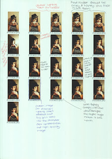
Taking these ideas into account I re-shoot this idea, I replicated the make-up ideas which I spoke about earlier on the models and photographed them in a dark room using a single spotlight the illuminate the image. Below are the four contact sheets.
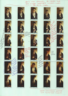
I do still want to continue with this ides but I need to develop it more as I want to use photographs rather than sequins and I don't want it to be too obstructed by light. Therefore I developed the idea of mixing a kaleidoscope with a view finder. So when a viewer looks through they see a photograph and using tabs and cut outs I will make it interactive so the viewer changes the photos according to what they want to look at. Below is a photoshop sketch of how I plan on making this idea:
Final Photographs
Now I know what I need to do I need to collect my photographs. Previously I have created the make-up photographs when developing my initial ideas. Therefore I looked back at these and decided which I liked and disliked so when I took my final photographs I had an idea of the sort of thing I was going for. Below is a contact strip of previous images:Taking these ideas into account I re-shoot this idea, I replicated the make-up ideas which I spoke about earlier on the models and photographed them in a dark room using a single spotlight the illuminate the image. Below are the four contact sheets.


Second Mock-up
Now I have all my images and I know what I want to create as my final piece I need to actually create a physical mock up of the kaleidoscope and viewfinder idea. I used my previous kaleidoscope mock up but changed it where necessary so I didn't have to make a new one. I used my chosen photo for the mad hatter for this. Below are the steps I took to create this idea:
Using a piece of mount board I traced around the end of the loo roll and then added a tab and cut this out using a craft knife. After this I cut the end of the plastic inside so it was about 5cm away from the end of the tube. I then cut a slot into the loo roll about 1cm away from the end of the plastic inside and cut this with a craft knife. I cut it about 0.2cm wide so it allowed the card to be slotted inside the loo roll. However, I found the card blocked out the light so you wouldn't be able to see the picture inside. Therefore I changed my material to acrylic so it was still sturdy and you could see through it. However the material wouldn't cut using a craft knife I had to use scissors but this made the acrylic shatter. I measured the size of the acrylic and printed and cut a picture of the 'Mad Hatter' out and using pritt-stick stuck it onto the acrylic. I then held the loo roll towards the light and you could see the image through and it did reflect.
After making this mock-up I found it worked well and would work in my exam. However there are a few thing I need to sort out. I have listed them below:
- Need to use bigger loo roll - small photo was poor quality bigger photo will be better also photo needs to be printed on good quality paper rather than printing paper, however need to test this as may have to due printing paper due to the different paper weights.
- Need to decorate loo roll well, at the moment it is covered in masking tape and it needs to look attractive to viewers.
- The eye hole is very basic, to in keep with the theme of Alice in Wonderland and the idea of looking at Fairy Tales from a distance would look good to have the eye hole cut in the shape of a key hole. Keep it black card as that worked well, could use thicker card though.
- Using plastic works but will need to cut it with laser cutter as craft knife doesn't work and scissors make it shatter - need to work out exact sizes and style so can cut it properly rather than having a few bits visible at the sides when you look through it. Use the template for the plastic back to print the pictures out on so they are the same size.
- I found it works best when pointed at light so may make a sign or something which says "point at light".
- Need to either use better plastic board for inside or use mirrors as at the moment not getting full effect, however it is squashed in the loo roll now so if it is proper size could work better - maybe use laser cutter to cut that as well so all equal size.
- Sticking the image to the plastic with pritt stick was fine and it stuck well.
Taking all this planning into account I now need to work on the final piece.
I like the photographs above and I feel the kaleidoscope effect works well for these images. However I still want to edit them more, below are my further edited kaleidoscope styled images. The order I have placed them in is the order I will stick them onto black paper with as they will tell the story through their positioning.
This image is introducing the idea of Wonderland. Within the story the White Rabbit draws Alice into Wonderland therefore the circles getting smaller draws the viewers eye into this image. The use of the colour brown mirrors mud which is within the rabbit hole Alice falls down. I tried to replicate the rabbit hole itself using coloured circles but it didn't look right whereas the lines looked better The circles emphasis the radial symmetry which gives the viewer a clear understanding of the bizaare nature of this story. Also it draws you to the person through the centre as where it has been her shoulder has joined to make a pattern in the centre. So the circles draw you to the centre then the pattern in the centre draws your eye back out to the faces. As well as the the lighting used creates, I feel, a beautiful example of chairoscuro. This one is slightly simple as it will be the first in the sequence. As the sequence progresses it will go to slight crazy with the Hatter but still stay happy but then develop into a sinister world with the Cheshire Cat before ending on a dark image with the Queen of Hearts.
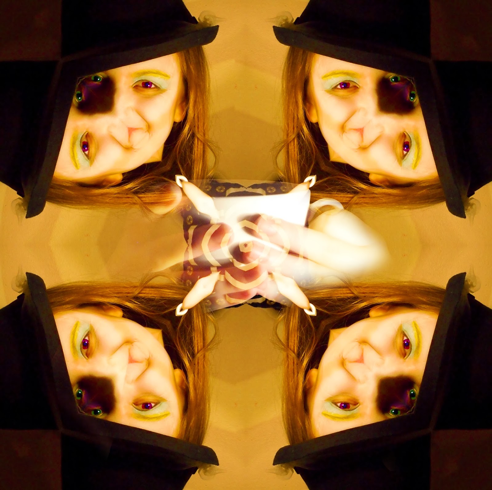 I have made this image very vibrant and colourful to juxtapose with the others. When I think of the Mad Hatter I think of an absurd character who isn't insane but looks crazy through his make-up and body. Therefore I have changed the colours on the eyes too look strange and bizarre mirroring the surreal ideas I feel this story represents. Another key thing about the Mad Hatter is his tea party therefore I too the cup from the original image and layered it over the rest of the objects here. I also replicated the pattern in the middle of the image where the top has been combined to show a possible hallucination/drug style scene as throughout the story their are prompts at drugs and this character could be associated with this idea. Therefore I wanted to show that here. Yet I still wanted it to stay light so I made the vibrancy very intense. However, I feel the radial symmetry is lost and it doesn't showcase the character as well as I hoped therefore I need to work on it more.
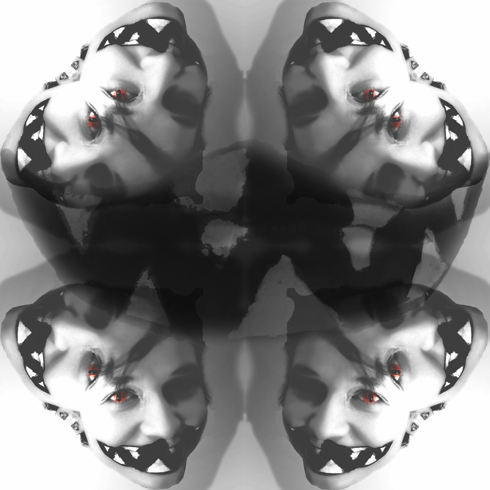
On the left is my Cheshire Cat kaleidoscope image. I have edited it by adding cat slits to the eyes on the model. I did this with her own pupil by cutting it from the eye and shrinking it either side to look like a slit. I also edited it further by adjusting the exposure, I did this originally so they looked slightly dream like and subdued but then I decided to make the exposure more prominent so the model stood out against the background. Also I cut the lips from another image where they were more in full view and added them to this image by using a screen overlay and a soft edged rubber around the lips so it floats. I feel this does accurately reflect my ideas as I have focused on how Alice in Wonderland is bizarre and surreal which is something I was keep on when developing this idea and it represents the darker side of Fairy Tales through the colours used. However, I feel the lips could be made more prominent by adjusting the opacity and possibly using a 'hard light' overlay as they are the key element of this character and feel this could be highlighted more.
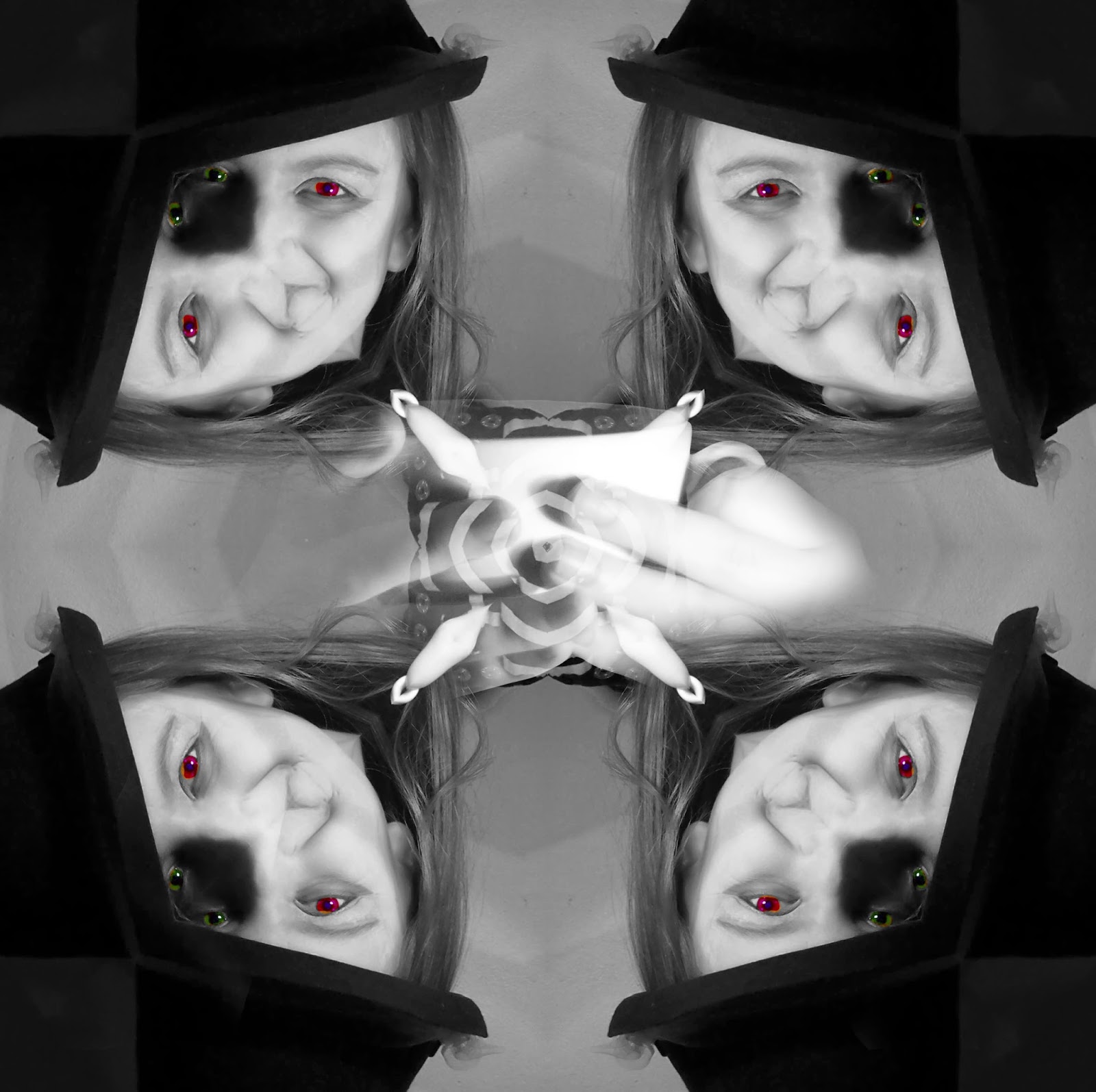
I have colour splashed this image to make it seem more dramatic. I highlighted the colour red as I feel this represents anger and passion, words often associated with this character. Within my personal study I found the artist Kirsty Mitchell used the colour red as a statement colour within her piece 'The Ghost Swift' therefore I have duplicated her techniques but used black and white to emphasise it more. The repetition of the red heart reinforces her character as she is the queen of hearts and the card on the side of her face emphasises this. Also the eyes being in colour draws the viewer to them as she is staring at the audience with an evil face showing her hatred and anger for others much like the original character. After doing this I plan on experimenting with my other images to see if this idea works for all my other characters.
The above images are my 'Final Images' I will print them out on A4 glossy paper so they retain their quality. However I also want to in keep with the idea of childhood and taking the observer back to their childhood. Therefore I am going to make a physical kaleidoscope to accompany these images.
Experimenting
After seeing how the circles in the White Rabbit image worked well to highlight the radial symmetry I wanted to try out this idea on the other images. However I changed the lines accordingly. I kept them circular but changed how the colours developed by using the gradient tool. Below are the other three images with this effect.
I did this in Photoshop by drawing some circles on the image and then rubbing them out so they didn't overlap the faces. I then did a gradient behind the circles so they progressed.
I feel the Cheshire Cat images works well as with the white edges the image has a natural circle shape which is emphasised. However, I want each one to look different so I will highlight the radial symmetry by making the Cheshire cat image into a circular image rather the square like the others.
The Mad Hatter one doesn't work very well but to be honest, the more I look at this image the more I dislike it. I feel I should re-shoot this as it doesn't reflect the character as well as the others and it doesn't have any kind of structure. Whereas the others have more meaning. I also want to get rid of the teacup in the centre and possibly replace it with a teapot.
The Red Queen doesn't work very well, I feel there is too much of the colour red and a bit too much going on within the image. This image had a sense of simple elegance about it with the colour splash so I feel this would be better left as it was.
As I said above the colour splash worked well on the Red Queen image so I wanted to test if this could work on the other images. I selected key colours and objects to bring into full colour.
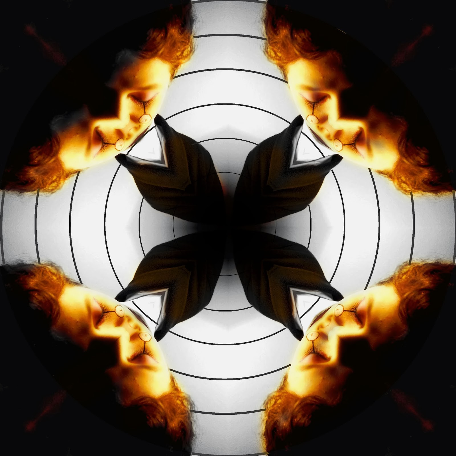
I didn't like the colour splash on these images. I feel they reduce the quality hugely. However, what I did learn from doing this is that the Cheshire Cat could easily be made into a circular image so that it looks better. The White Rabbit image makes the model look orange which is never a good look. The Mad Hatter isn't obvious enough and I liked how colourful it was and the craziness of it but that is completely lost here. Therefore, I am going to need to work on this a lot more.
Cheshire Cat Change
I decided to make some further changes to the Cheshire Cat. I added a white circle border around the image so the corners were more rounded adding to the radial symmetry. I also changed the overlay of the lips to make them more prominent. I changed it from 'Screen' to 'Multiply' as I felt these were a key element to this character and should be a focal point.
Mad Hatter Change
As I have said previously I need to change my Mad Hatter image. I have decided to use a top hat rather than a bowler as this conveys the character more. Also I liked how the eyes where different colours so therefore I have decided to photograph from the nose up so the whole top hat was in shot and the eyes were a focal point. Below is a contact strip annotated of the new images.
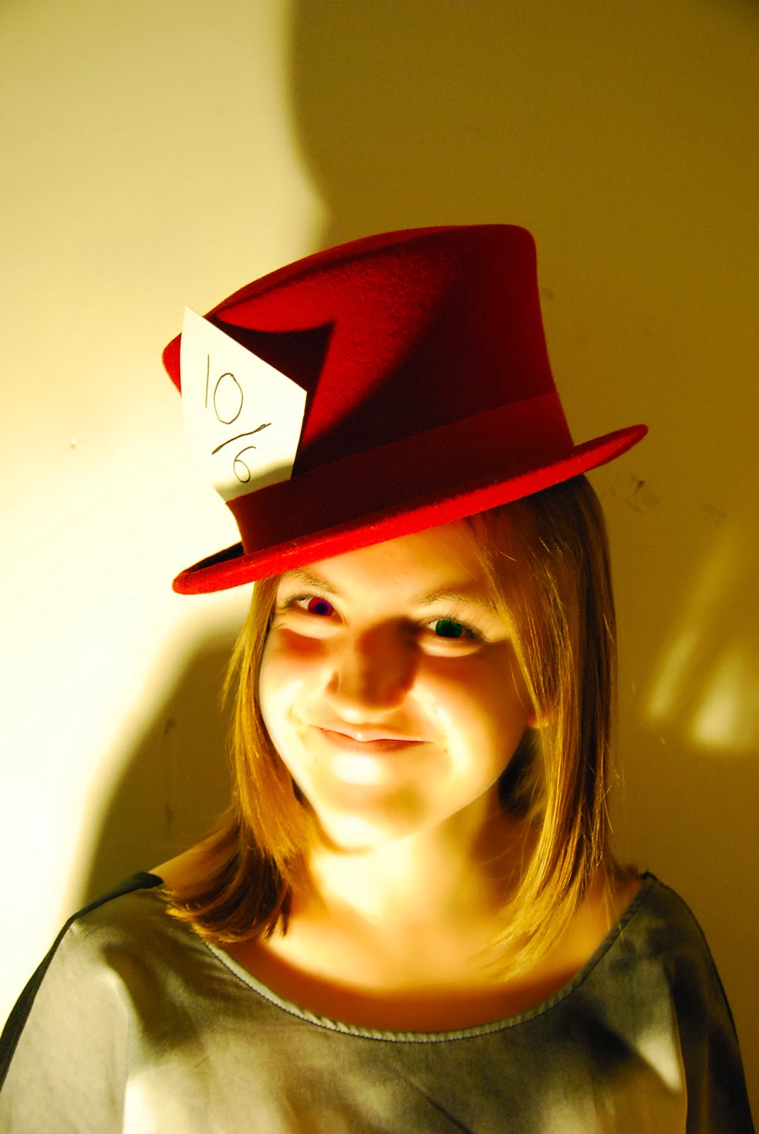 Now I have decided on a image I needed to develop it. I used the same adjustment techniques as before however, this time I didn't use any make-up as I felt I didn't need too they were good as they were. I changed the eye colour as I liked this before and I made the image more vibrant. I also added an airbrush effect so it linked back to my previous ideas of editorial photography. However, I do feel the lighting on the other images was stronger but this image is still good. Also the red top hat stands out more and adds to the craziness of this character. The card however isn't very strong the colour of the writing on the card needs to be made bolder so it stands out more.
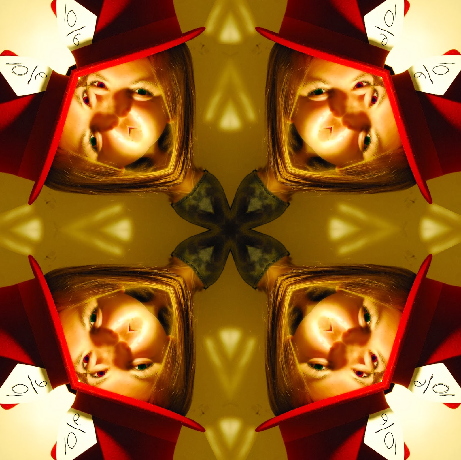
I then applied the same kaleidoscope effect over the image as before and made some further adjustments. I wanted to highlight repetition and add to the radial symmetry so I repeated the arrow which had formed from the lighting on the wall to add to the repetition. I also drew over the 10/6 with a 2pt black pen so it was clearer. I wasn't overly happy about how the mouth and nose had merged I feel this didn't look great but there wasn't much I could do about in unfortunately. There are some marks on the wall however and these need to be erased which I will do before I send this new photo to be printed A3.
I have experimented with this idea a few times now and have found this idea works best when using mirrors are the reflection is better and possibly using stronger acrylic as well as the photographs being printed on high quality paper.
I did have a few issues with this idea however. To start with the mirrors I cut were too big for any tubes I had, so therefore I had to make a tube by cutting two loo roll tubes in half then placing them with one another. This meant the tube which held the mirrors wasn't going to be perfectly circular therefore I decided to change my idea slightly. As I am using the physical kaleidoscope to physically show my ideas of childhood and trying the take the viewer back to their childhood but showing the story of Alice in Wonderland in a sinister way with the photographs. I will make the kaleidoscope look childish. I will accessorise the tube with a 'sketch' on Illustrator and then make it look as though it was made by a child through the use of the awkwardly shaped tube.
Also instead of having the slot for my images to fit into as a viewfinder I will use a cable tie and attach them to the bottom of the kaleidoscope and the viewer will choose which photograph to look at and hold it in front on the end to see it through the mirrors.
Eye Hole
I wanted to make the kaleidoscope look almost as if it was a prop from Alice in Wonderland and that it could tell the story. Also I wanted to mirror my previous ideas of Fairy Tales representing other worlds which we want to see more of and enjoy. Therefore for the eye hole I made it look as though it was a key hole and that your eye was the key to this other world.
I will combine this with the illustration so it all covers the wrap. I plan on producing something which can be placed over the top of the kaleidoscope and drop down over the rest of it so it covers it properly.
Placing Images
So, firstly I need to size my images according the the tube and acrylic discs which I cut out on a laser cutter prior to the exam. I want to ensure they retain their quality when they are on a discs so will print them out on photo paper also.
Covering the Kaleidoscope
As I drilled through the circular discs so they had a hole to attach them onto the tube one sadly broke in half so I was only able to show 3 photographs on 3 discs. Therefore I decided not to show the White Rabbit but rather illustrate over it and have it as a wrap for my kaleidoscope. This will add to the idea of the White Rabbit leading you to Wonderland as it leads you to the end of the kaleidoscope where the pictures will be. Therefore as I said earlier I will draw over this with a 'sketch' effect to add to the childish nature of this idea.
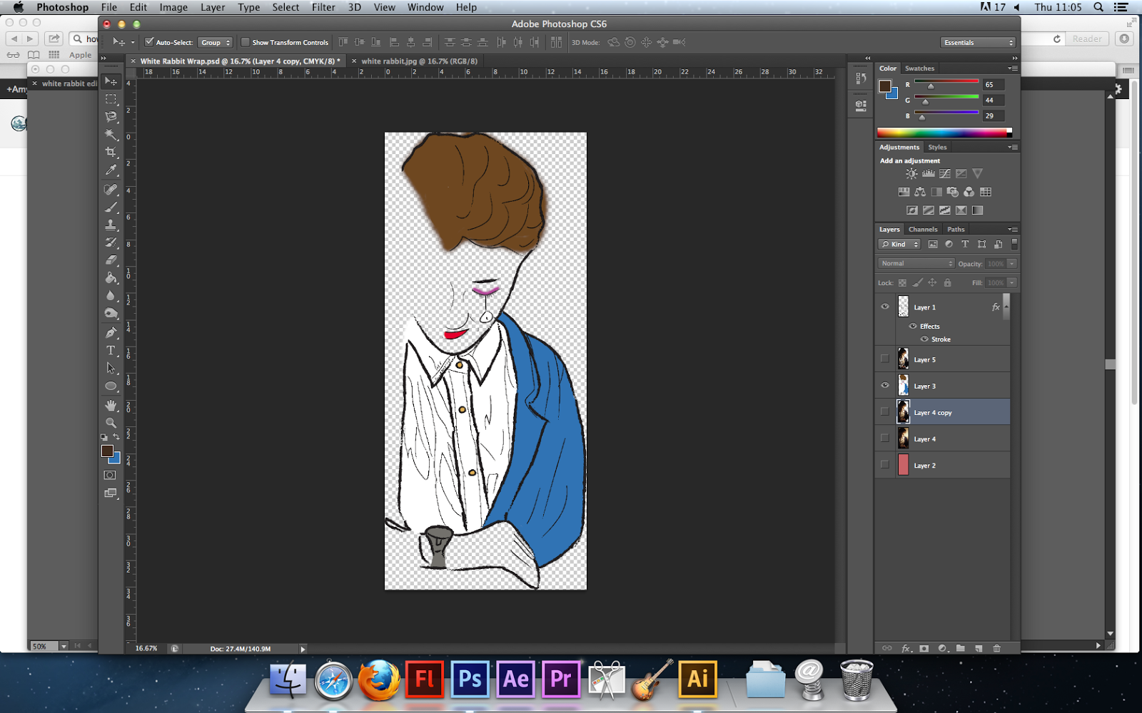
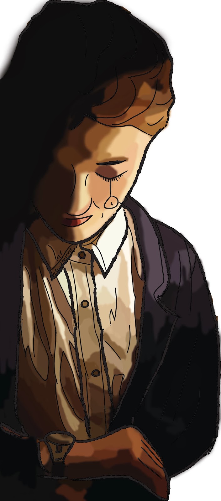
On the far left are two screen shots. The top one is how the image looked in illustrator once I had drawn over it. I used a sketch effect brush as I found when I was producing illustrations before for my response to Helen Oxenbury this effect gave it a childlike effect which is something I was aiming to replicate in my own work. The second screen shot is when I took the image into Photoshop and tried to add colour. Originally I added block colours as you can see but then I decided I wanted it to be more dynamic and look more realistic therefore I used a colour picker and a faded edge brush to colour in sections of the sketch until eventually I achieved the third image which I what I will use when covering my kaleidoscope.
Finished Kaleidoscope
I had wrapped the kaleidoscope and cut and stuck the pictures onto the acrylic circles now all that was left was to put it all together.
 I stuck the end of the wrap over the edge of the bottom of the roll as it was sticking out. However as you can see with the image on the left where the paper was folded the top of the kaleidoscope had been pulled and looked messy. Therefore I covered this in purple tissue paper to match the top and covered the inside in the same paper. Them I punched a hole in the bottom of the kaleidoscope and threaded a cable tie through it and connect this to the circles using the hole in them and then that was it. Therefore all the viewer has to do is twist and hold the photo in front of the end and then look through the key hole to see.
Photographing Through the Kaleidoscope
Below are some photographs I took from the key hole/eye hole through the kaleidoscope. They are on a contact sheet which I have analysed.

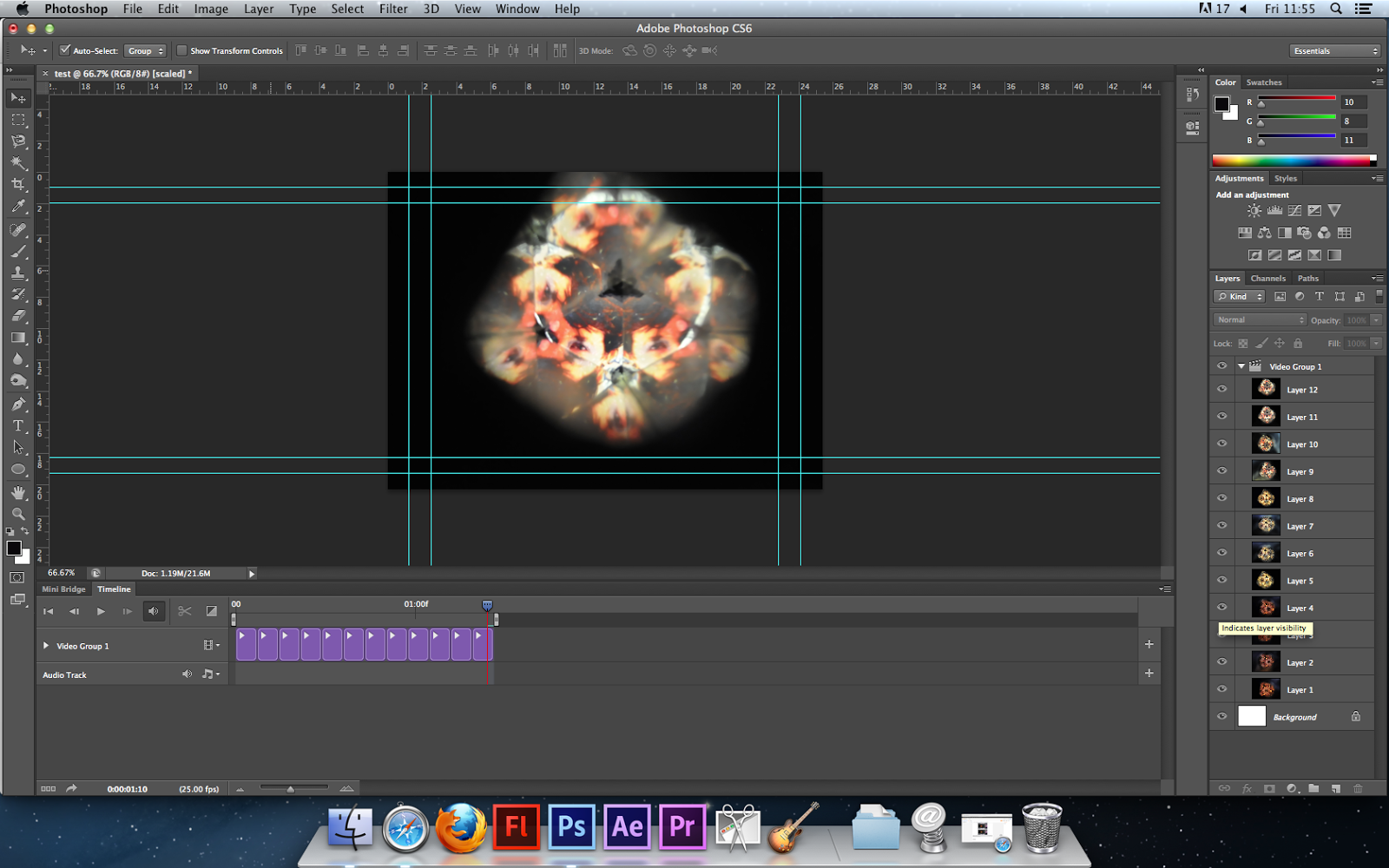 I selected four pictures of each character through the kaleidoscope and place them into a Photoshop edit. I then placed them into the timeline and shortened each image to be 3 seconds long. Below is the short clip.
Exam Time
Below I will put all the work I do during the exam here.
I began with the Cheshire Cat, originally I wanted her to just be a floating head however when I tried to content-aware the rest of her body it didn't work well (as shown in the screen shot on the left) therefore I changed it by adding a gradient using the same colours are the original background and then made a 'fake' shadow by duplicating the layer and overlaying it and altering the opacity.
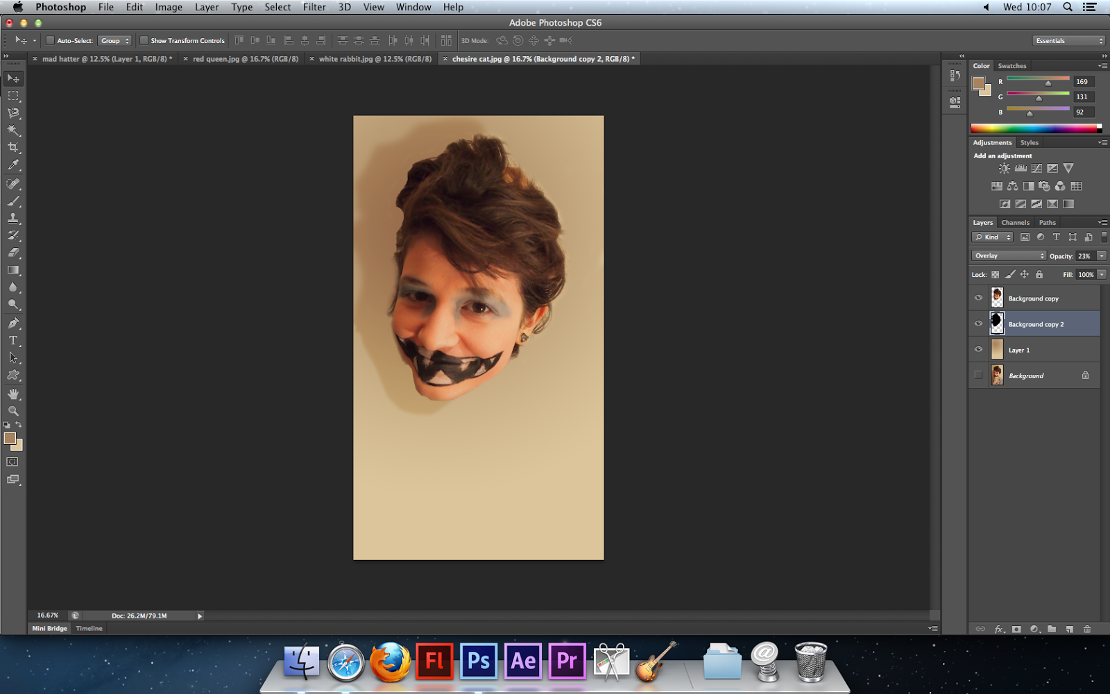 The soft edge rubber gives the cat a Fairy Tale quality as it makes it more childlike/dreamlike due to it not being fully there, it also reflects the character itself from the story. The shadow was copied then had a colour change and overlayed to look realistic. I feel this does look slightly realistic but there still need to be some colour changes and enhancements.
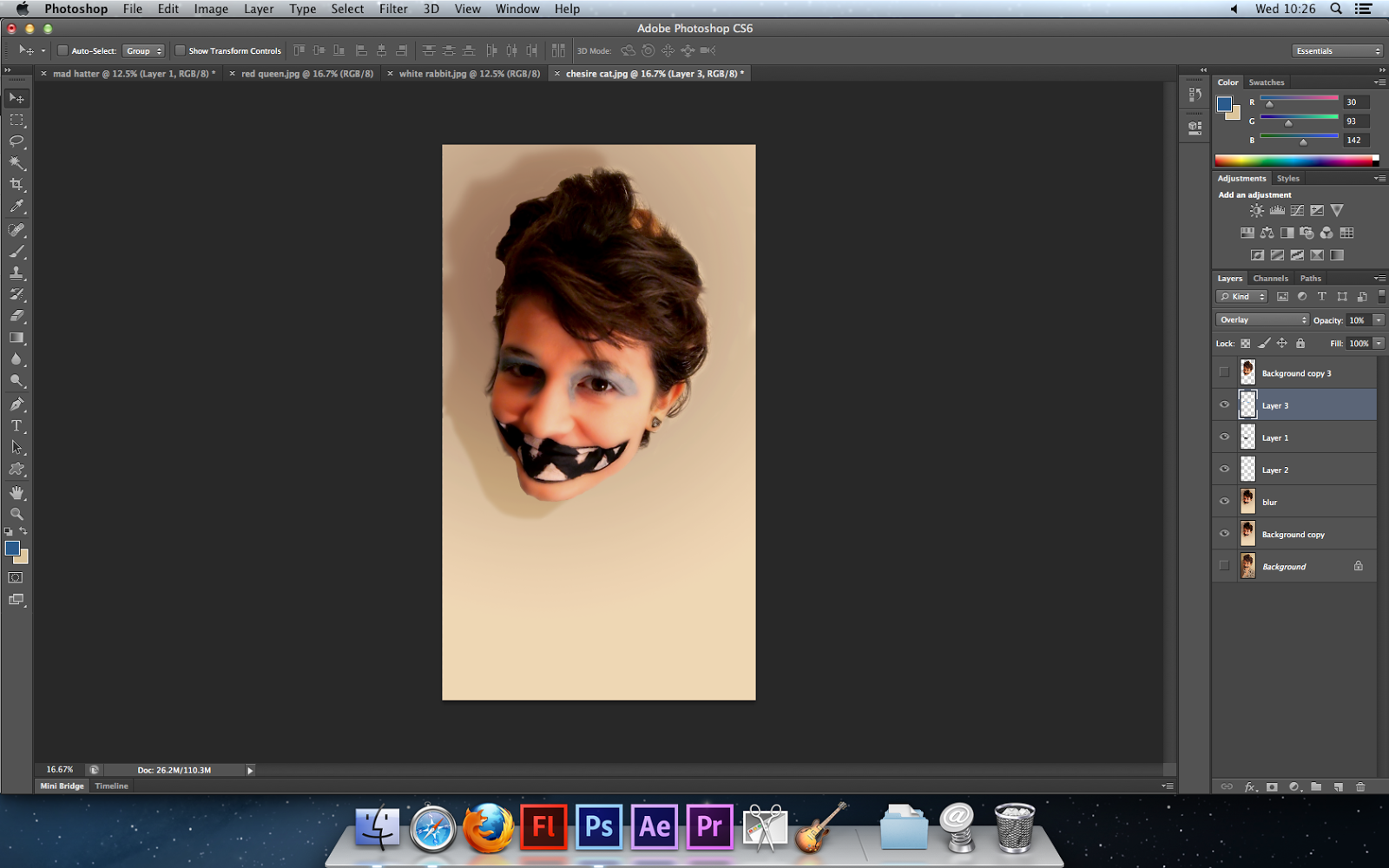 Next I used an airbrushing technique to make her skin look smoother so the photograph reflected the idea of magazine/editorial photography. I did this by applying gaussain blur and lowering the opacity. Then I applied a similar technique to enhance the colours on the page by selecting the colours with the colour picker e.g. black for the mouth and then coloured in the black behind the mouth and overlaid it. I need to apply some finishing touches but then it should be complete. I will apply the same techniques as above to all my images. Below are the edited chosen images:
I have edited all these images in the same way through Adobe Photoshop and I am happy with how they all look so far. However I would like to experiment with them more slightly, possibly use colour splash on certain parts so the iconic part of the make-up stands out e.g. lips for the Cheshire Cat. Also the Cheshire Cat doesn't link as well with the rest of them as it lacks dramatic lighting therefore I will try out some lighting effects on Photoshop before I tae my next step.
Kaleidoscope Effect
The next step is to work on the kaleidoscope effect. I am using a YouTube tutorial to help e when making this so I can work it properly.
Left is the new Cheshire Cat image which I edited as I spoke of before. I added a lighting effect over the whole image to try and make it more dramatic with the lighting and still keep it slightly bright. I will now use this and the other 3 images to create my kaleidoscope idea.
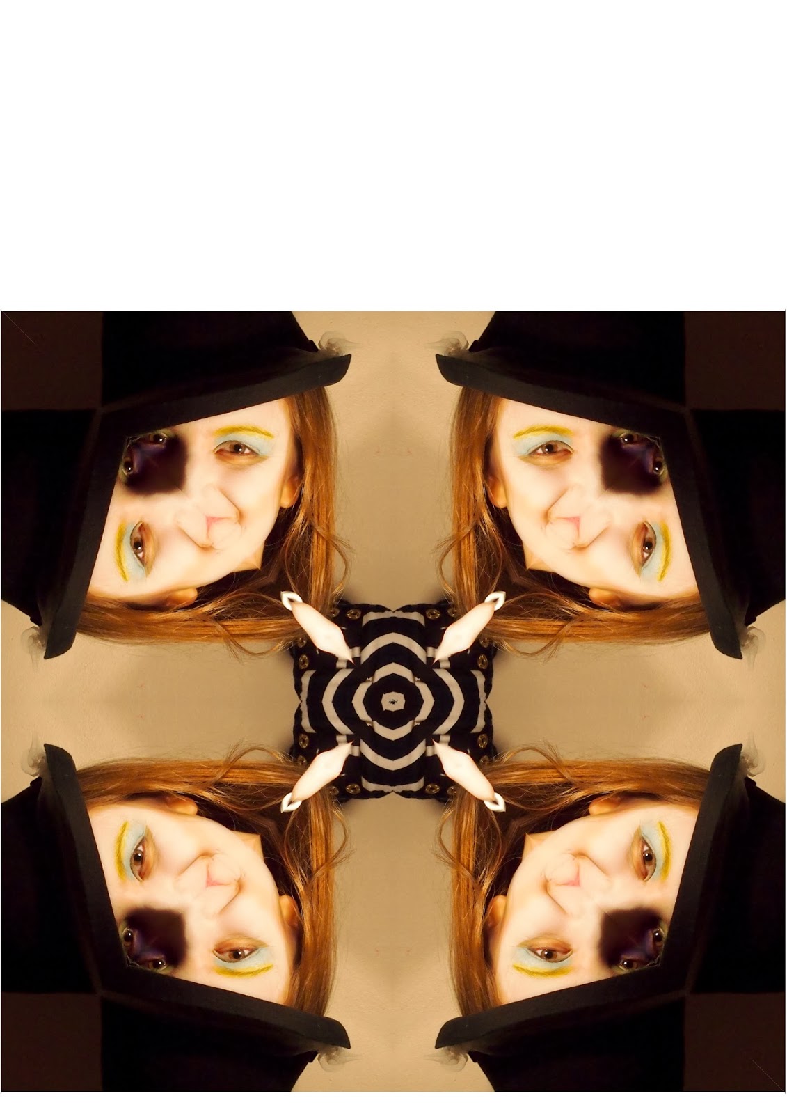
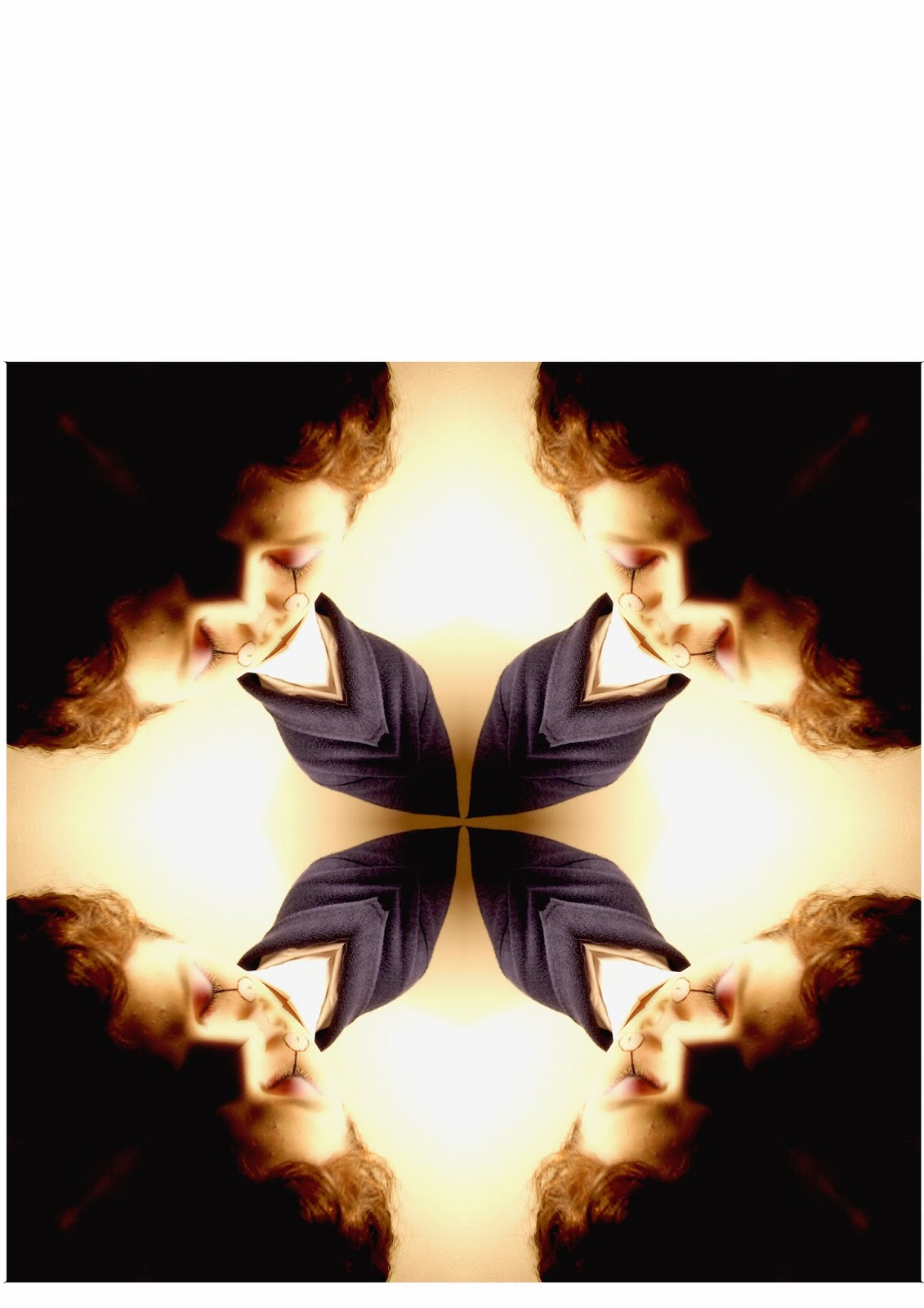
On the left are the six steps I took to make my kaleidoscope effect on Photoshop. I started with an image skewed it so I only selected a triangle of it. I then copied it onto a new layer and copied it to the left of it so they met in the middle. I copied this for all the images until I got my final thing. For this I merged all the photographs together, however I found this didn't give the fully effect. Therefore I am going to repeat the process again but this time I will only use the one image. Below are the outcomes.
Further EditingCreating the Photographs
Step 1: Editing my chosen photographsI began with the Cheshire Cat, originally I wanted her to just be a floating head however when I tried to content-aware the rest of her body it didn't work well (as shown in the screen shot on the left) therefore I changed it by adding a gradient using the same colours are the original background and then made a 'fake' shadow by duplicating the layer and overlaying it and altering the opacity.
 The soft edge rubber gives the cat a Fairy Tale quality as it makes it more childlike/dreamlike due to it not being fully there, it also reflects the character itself from the story. The shadow was copied then had a colour change and overlayed to look realistic. I feel this does look slightly realistic but there still need to be some colour changes and enhancements.
  Next I used an airbrushing technique to make her skin look smoother so the photograph reflected the idea of magazine/editorial photography. I did this by applying gaussain blur and lowering the opacity. Then I applied a similar technique to enhance the colours on the page by selecting the colours with the colour picker e.g. black for the mouth and then coloured in the black behind the mouth and overlaid it. I need to apply some finishing touches but then it should be complete. I will apply the same techniques as above to all my images. Below are the edited chosen images:
I have edited all these images in the same way through Adobe Photoshop and I am happy with how they all look so far. However I would like to experiment with them more slightly, possibly use colour splash on certain parts so the iconic part of the make-up stands out e.g. lips for the Cheshire Cat. Also the Cheshire Cat doesn't link as well with the rest of them as it lacks dramatic lighting therefore I will try out some lighting effects on Photoshop before I tae my next step.
Kaleidoscope Effect
The next step is to work on the kaleidoscope effect. I am using a YouTube tutorial to help e when making this so I can work it properly.
Left is the new Cheshire Cat image which I edited as I spoke of before. I added a lighting effect over the whole image to try and make it more dramatic with the lighting and still keep it slightly bright. I will now use this and the other 3 images to create my kaleidoscope idea.
On the left are the six steps I took to make my kaleidoscope effect on Photoshop. I started with an image skewed it so I only selected a triangle of it. I then copied it onto a new layer and copied it to the left of it so they met in the middle. I copied this for all the images until I got my final thing. For this I merged all the photographs together, however I found this didn't give the fully effect. Therefore I am going to repeat the process again but this time I will only use the one image. Below are the outcomes.


I like the photographs above and I feel the kaleidoscope effect works well for these images. However I still want to edit them more, below are my further edited kaleidoscope styled images. The order I have placed them in is the order I will stick them onto black paper with as they will tell the story through their positioning.
This image is introducing the idea of Wonderland. Within the story the White Rabbit draws Alice into Wonderland therefore the circles getting smaller draws the viewers eye into this image. The use of the colour brown mirrors mud which is within the rabbit hole Alice falls down. I tried to replicate the rabbit hole itself using coloured circles but it didn't look right whereas the lines looked better The circles emphasis the radial symmetry which gives the viewer a clear understanding of the bizaare nature of this story. Also it draws you to the person through the centre as where it has been her shoulder has joined to make a pattern in the centre. So the circles draw you to the centre then the pattern in the centre draws your eye back out to the faces. As well as the the lighting used creates, I feel, a beautiful example of chairoscuro. This one is slightly simple as it will be the first in the sequence. As the sequence progresses it will go to slight crazy with the Hatter but still stay happy but then develop into a sinister world with the Cheshire Cat before ending on a dark image with the Queen of Hearts.
 I have made this image very vibrant and colourful to juxtapose with the others. When I think of the Mad Hatter I think of an absurd character who isn't insane but looks crazy through his make-up and body. Therefore I have changed the colours on the eyes too look strange and bizarre mirroring the surreal ideas I feel this story represents. Another key thing about the Mad Hatter is his tea party therefore I too the cup from the original image and layered it over the rest of the objects here. I also replicated the pattern in the middle of the image where the top has been combined to show a possible hallucination/drug style scene as throughout the story their are prompts at drugs and this character could be associated with this idea. Therefore I wanted to show that here. Yet I still wanted it to stay light so I made the vibrancy very intense. However, I feel the radial symmetry is lost and it doesn't showcase the character as well as I hoped therefore I need to work on it more.
On the left is my Cheshire Cat kaleidoscope image. I have edited it by adding cat slits to the eyes on the model. I did this with her own pupil by cutting it from the eye and shrinking it either side to look like a slit. I also edited it further by adjusting the exposure, I did this originally so they looked slightly dream like and subdued but then I decided to make the exposure more prominent so the model stood out against the background. Also I cut the lips from another image where they were more in full view and added them to this image by using a screen overlay and a soft edged rubber around the lips so it floats. I feel this does accurately reflect my ideas as I have focused on how Alice in Wonderland is bizarre and surreal which is something I was keep on when developing this idea and it represents the darker side of Fairy Tales through the colours used. However, I feel the lips could be made more prominent by adjusting the opacity and possibly using a 'hard light' overlay as they are the key element of this character and feel this could be highlighted more.
I have colour splashed this image to make it seem more dramatic. I highlighted the colour red as I feel this represents anger and passion, words often associated with this character. Within my personal study I found the artist Kirsty Mitchell used the colour red as a statement colour within her piece 'The Ghost Swift' therefore I have duplicated her techniques but used black and white to emphasise it more. The repetition of the red heart reinforces her character as she is the queen of hearts and the card on the side of her face emphasises this. Also the eyes being in colour draws the viewer to them as she is staring at the audience with an evil face showing her hatred and anger for others much like the original character. After doing this I plan on experimenting with my other images to see if this idea works for all my other characters.
The above images are my 'Final Images' I will print them out on A4 glossy paper so they retain their quality. However I also want to in keep with the idea of childhood and taking the observer back to their childhood. Therefore I am going to make a physical kaleidoscope to accompany these images.
Experimenting
After seeing how the circles in the White Rabbit image worked well to highlight the radial symmetry I wanted to try out this idea on the other images. However I changed the lines accordingly. I kept them circular but changed how the colours developed by using the gradient tool. Below are the other three images with this effect.
I did this in Photoshop by drawing some circles on the image and then rubbing them out so they didn't overlap the faces. I then did a gradient behind the circles so they progressed.
I feel the Cheshire Cat images works well as with the white edges the image has a natural circle shape which is emphasised. However, I want each one to look different so I will highlight the radial symmetry by making the Cheshire cat image into a circular image rather the square like the others.
The Mad Hatter one doesn't work very well but to be honest, the more I look at this image the more I dislike it. I feel I should re-shoot this as it doesn't reflect the character as well as the others and it doesn't have any kind of structure. Whereas the others have more meaning. I also want to get rid of the teacup in the centre and possibly replace it with a teapot.
The Red Queen doesn't work very well, I feel there is too much of the colour red and a bit too much going on within the image. This image had a sense of simple elegance about it with the colour splash so I feel this would be better left as it was.
As I said above the colour splash worked well on the Red Queen image so I wanted to test if this could work on the other images. I selected key colours and objects to bring into full colour.


I didn't like the colour splash on these images. I feel they reduce the quality hugely. However, what I did learn from doing this is that the Cheshire Cat could easily be made into a circular image so that it looks better. The White Rabbit image makes the model look orange which is never a good look. The Mad Hatter isn't obvious enough and I liked how colourful it was and the craziness of it but that is completely lost here. Therefore, I am going to need to work on this a lot more.
Cheshire Cat Change
I decided to make some further changes to the Cheshire Cat. I added a white circle border around the image so the corners were more rounded adding to the radial symmetry. I also changed the overlay of the lips to make them more prominent. I changed it from 'Screen' to 'Multiply' as I felt these were a key element to this character and should be a focal point.
Mad Hatter Change
As I have said previously I need to change my Mad Hatter image. I have decided to use a top hat rather than a bowler as this conveys the character more. Also I liked how the eyes where different colours so therefore I have decided to photograph from the nose up so the whole top hat was in shot and the eyes were a focal point. Below is a contact strip annotated of the new images.
 Now I have decided on a image I needed to develop it. I used the same adjustment techniques as before however, this time I didn't use any make-up as I felt I didn't need too they were good as they were. I changed the eye colour as I liked this before and I made the image more vibrant. I also added an airbrush effect so it linked back to my previous ideas of editorial photography. However, I do feel the lighting on the other images was stronger but this image is still good. Also the red top hat stands out more and adds to the craziness of this character. The card however isn't very strong the colour of the writing on the card needs to be made bolder so it stands out more.
I then applied the same kaleidoscope effect over the image as before and made some further adjustments. I wanted to highlight repetition and add to the radial symmetry so I repeated the arrow which had formed from the lighting on the wall to add to the repetition. I also drew over the 10/6 with a 2pt black pen so it was clearer. I wasn't overly happy about how the mouth and nose had merged I feel this didn't look great but there wasn't much I could do about in unfortunately. There are some marks on the wall however and these need to be erased which I will do before I send this new photo to be printed A3.
Making the Kaleidoscope
As my main Mock Exam response is the four photographs above which represent a kaleidoscope photograph I have also made a kaleidoscope as a secondary piece of work to encapsulate my theme. I will take photographs down the kaleidoscope and these photographs will produce another response piece which will go underneath the photographs above.
I did have a few issues with this idea however. To start with the mirrors I cut were too big for any tubes I had, so therefore I had to make a tube by cutting two loo roll tubes in half then placing them with one another. This meant the tube which held the mirrors wasn't going to be perfectly circular therefore I decided to change my idea slightly. As I am using the physical kaleidoscope to physically show my ideas of childhood and trying the take the viewer back to their childhood but showing the story of Alice in Wonderland in a sinister way with the photographs. I will make the kaleidoscope look childish. I will accessorise the tube with a 'sketch' on Illustrator and then make it look as though it was made by a child through the use of the awkwardly shaped tube.
Also instead of having the slot for my images to fit into as a viewfinder I will use a cable tie and attach them to the bottom of the kaleidoscope and the viewer will choose which photograph to look at and hold it in front on the end to see it through the mirrors.
Eye Hole
I wanted to make the kaleidoscope look almost as if it was a prop from Alice in Wonderland and that it could tell the story. Also I wanted to mirror my previous ideas of Fairy Tales representing other worlds which we want to see more of and enjoy. Therefore for the eye hole I made it look as though it was a key hole and that your eye was the key to this other world.
I will combine this with the illustration so it all covers the wrap. I plan on producing something which can be placed over the top of the kaleidoscope and drop down over the rest of it so it covers it properly.
Placing Images
So, firstly I need to size my images according the the tube and acrylic discs which I cut out on a laser cutter prior to the exam. I want to ensure they retain their quality when they are on a discs so will print them out on photo paper also.
Covering the Kaleidoscope
As I drilled through the circular discs so they had a hole to attach them onto the tube one sadly broke in half so I was only able to show 3 photographs on 3 discs. Therefore I decided not to show the White Rabbit but rather illustrate over it and have it as a wrap for my kaleidoscope. This will add to the idea of the White Rabbit leading you to Wonderland as it leads you to the end of the kaleidoscope where the pictures will be. Therefore as I said earlier I will draw over this with a 'sketch' effect to add to the childish nature of this idea.


On the far left are two screen shots. The top one is how the image looked in illustrator once I had drawn over it. I used a sketch effect brush as I found when I was producing illustrations before for my response to Helen Oxenbury this effect gave it a childlike effect which is something I was aiming to replicate in my own work. The second screen shot is when I took the image into Photoshop and tried to add colour. Originally I added block colours as you can see but then I decided I wanted it to be more dynamic and look more realistic therefore I used a colour picker and a faded edge brush to colour in sections of the sketch until eventually I achieved the third image which I what I will use when covering my kaleidoscope.
Below is how it looked.
I found the bottom looked messy where the lines overlapped therefore I decided to take a quote from Alice in Wonderland and using a 'fancy' type face I will stick it onto the bottom and accessorises it so it does stand out and looks as though it's meant to be there and hides the seam.
I found the bottom looked messy where the lines overlapped therefore I decided to take a quote from Alice in Wonderland and using a 'fancy' type face I will stick it onto the bottom and accessorises it so it does stand out and looks as though it's meant to be there and hides the seam.
Finished Kaleidoscope
I had wrapped the kaleidoscope and cut and stuck the pictures onto the acrylic circles now all that was left was to put it all together.
 I stuck the end of the wrap over the edge of the bottom of the roll as it was sticking out. However as you can see with the image on the left where the paper was folded the top of the kaleidoscope had been pulled and looked messy. Therefore I covered this in purple tissue paper to match the top and covered the inside in the same paper. Them I punched a hole in the bottom of the kaleidoscope and threaded a cable tie through it and connect this to the circles using the hole in them and then that was it. Therefore all the viewer has to do is twist and hold the photo in front of the end and then look through the key hole to see.
 Photographing Through the Kaleidoscope
Below are some photographs I took from the key hole/eye hole through the kaleidoscope. They are on a contact sheet which I have analysed.

From the above contact sheet I will now take my chosen images into Photoshop and create a photograph which possibly combines all these images to reflect - I feel - the bizarre and surreal nature of this project. The previous photographs I have done which are the main feature of my response are very refined and finished so I want this to be a little bit more 'crazy' and absurd.
Below are how the chosen images looked once the had been edited in Photoshop using the levels, curves, vibrance and brightness/contrast.
However I found they still didn't look right therefore I had a slight moment of madness and decided to develop this idea into a small and short animation. I will use Photoshop to make the animation and hope for the best!
 I selected four pictures of each character through the kaleidoscope and place them into a Photoshop edit. I then placed them into the timeline and shortened each image to be 3 seconds long. Below is the short clip.
 Evaluation
What is your work about? Tell the story
My work is about the distorted world of 'Wonderland' and Fairy Tales. I decided to focus on Alice in Wonderland as I love how strange this tale is. When I was researching this tale I found there are far more complex ideas about this story than I first believed and I wanted to mirror that within my own work. The four photographs show two young females emulating key characters from the story. I used teenage models as a key theme within the story is The Tragic and Inevitable Loss of Childhood Innocence therefore I wanted these characters to show their childhood by being beloved characters from the tale but something was wrong. Also another key motif is Curious, Nonsense and Confusing so the use of the kaleidoscope effect gives off this idea as the viewer is transported back to their childhood but in a more sinister way.
How did you make it and what media did you use? Describe it
The key part of my mock exam response was the four photographs. These were made in photoshop using a variety of tools. Initially I edited the photographs and then placed them into the kaleidoscope effect. On all images I used an airbrushing technique as a key part of my idea was based on Annie Leibovitz and editorial photographer and she uses these techniques. I wanted to mirror each character within the kaleidoscope effect final photograph so edited them to highlight this. For example, the main part of the red queen is of course the colour and the darkness/evil surrounding her so I made her black and white so she was dark and sinister but then colour splashed red within the image to highlight her character. Whereas for the White Rabbit he runs down the rabbit hole so I created circles going smaller to the centre to mirror the idea of falling down the rabbit hole. I also had a 3D sphere which was a kaleidoscope, a secondary piece of equipment which I added to highlight the idea of childhood and allow the viewer to be interactive with my work. Also I had a very short animation of photographs taken inside the kaleidoscope so the viewer understands the kaleidoscope's purpose.
How did you develop your main idea? How did it change as you progressed? Which artists influenced you?
I have had a keen interest in Fairy Tales since the start of my year and have progressed this through my investigative work for my personal study. I looked at Helen Oxenbury and Annie Leibovitz in the planning for my mock exam as they are key artistic influences throughout this project. From their work I liked the idea of using illustrations, representing the darker and more sinister side of Fairy Tales, creating a bizarre and surreal piece of artwork, using adult/teenage models, and of course the theme of Alice in Wonderland. I furthered these ideas and through various brainstorming sessions I developed an idea of using make-up to represent characters from the tale. Originally my final idea was to take photographs of female models in an editorial style with make-up which represents characters from Alice in Wonderland and print them out and place into a book diorama. However when I mocked up this idea I found the book diorama looked poor quality and as the photographs were printed then re-photoraphed they lost their quality. Therefore I looked back at my final idea brainstorm and thought about what I liked most about Fairy Tales; looking at things from a distance, sense of nostalgia and how audience perceive the image. From this I developed the idea of a kaleidoscope. Firstly I was going to have a few of these for my final piece. However I felt this wasn't a strong idea for a final response piece. So I decided to create some fake kaleidoscope images using Photoshop tutorials and then printed them off on A3 glossy paper. I did create a kaleidoscope but this was only to accessorise my final piece.
What worked and what didn't work?
Many things didn't work throughout the planning but the final piece worked successfully I feel and I was happy with how the final piece looked. To start with the kaleidoscope idea didn't work very well. I couldn't get a large enough tube to fit the mirrors into so had to stick two loo rolls together which meant it wasn't perfectly circular. Also because of this I cut the circles for the photographs to be printed onto to place into the kaleidoscope too big so they didn't fit. However all of this was good as it meant I needed to look for another way of showing these photographs which meant I created a series of four kaleidoscope images in Photoshop which were of much higher quality and looked a lot better than my original idea. I feel the photographs were the best part as they show my ideas and themes well.
If you had the opportunity to do your work again what would you change?


No comments:
Post a Comment