Response: Paris

Now the Paris trip is over we have to produce an exhibition to show to parents and other students. As part of this exhibition we need to show:
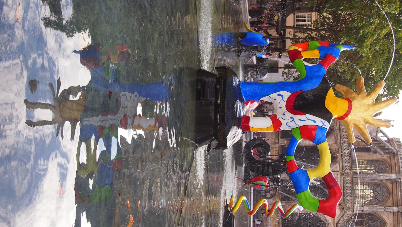
  • A best photo from Paris
  • A photograph of ourselves in Paris
  • A grid of photographs relating to the idea of Spotlight
  • A photograph of the number 34
  • A response piece to Paris
The work below is the build and final response piece. The other parts of my exhibition I have shown in the Paris Trip Page.

Planning

Paris was an incredible experience and creating a response to this is going to be difficult. I need to decide on medias, artists, aspects of the trip and my own themes. Below is a rough brainstorm exploring these ideas.


Brainstorm:

Below is a link to brainstorm which I made on Prezi.com. I feel brainstorms are a good place to start when planning a response. So using this brainstorm I looked at 4 different medias which I could explore when creating my response. You can navigate around it by using the left and right arrow keys on your keyboard and to look at a photo on a larger scale simply click the photo with your mouse and it'll enlarge.

Planning Idea 1

From my brainstorm I came up with many different ideas. One I liked which I'm going to experiment in further is:

Using my photos from Paris I will place them together into a landscape Photoshop document then take it into Illustrator and draw over half of the image and then leave the other half leave it as a photo combining both illustration and photography. Much like an artist I saw in the Pompidou.

I based this idea around two images, one called La Mort de Caius Gracchus (Death of Caius Gracchus) and the other called La View et al Mort du peuple (The People's Life and Death). The two pictures, shown below, combine both photography and illustration in an interesting way and seeing this on such a grand scale in the museum was amazing. I have made many notes of analysis about these particular pieces on my blog post titled 'Day 2: The Pompidou'.


I feel the combination of medias makes for an interesting final image and I will replicate this. However I don't want to depict something violent and serious, instead I will depict a typical Paris landscape. Consisting of iconic things I saw in Paris I will combine them in a piece together. Below is a scanned page of my rough draft of what I hope it'll look like.

Across my trip of Paris I documented each day and each landmark I saw. So I will place my photos in the order I saw them in. In order to avoid spending uncessary time filtering through photographs of what to use I will look at my past blog posts and use the 'best photo' from each post which represents a location/landmark. Below are the photos I will use and the order I will use them in:


Day 1:


Day 2:


Day 3:


Day 4:


The next step is to place these images into a Photoshop document in which they will be placed next to/near each other to display a timeline. I'll show this in the following blog post.


Mocking-Up Idea 1

To make the photographs flow better I cut out the background so the objects were the main focus, for some image this worked better than others but I will place a blue background underneath the piece so it flows better and add some clouds which I will take off another photo. Then as the photo changes from photograph to illustration so will the clouds. The image on the left is the one I will use, I will repeat it and enlarge it in Photoshop. As I am just mocking up this idea I am only going to combine two days from the trip, the first and the third then see if I like if before doing the full thing. The reason I chose the third is because I will use the image on the third day to change from photo to illustration.

I removed the background from the images using content aware, below are the photos alongside some screen shots as some photos needed more editing than others.

Day 1:
This photo wasn't my original choice for my piece however after some consideration I decided to change it as the colours on this one were brighter which meant it would blend better with the other images. To edit this I simply used the Pologonal Lasso Tool and drew a line around the pyramid and then cut the top off of the photo.


Using a combination of the Magnetic Lasso Tool and the Magic Wand Tool I removed all the background from the photo so the Arch De-Trumph stood alone. I then enhanced the levels to make it darker before coping the image over.


Using the magic wand tool I removed all the background then a few bits were removed with the quick selection tool.


For this image I changed the tolerance of the Magic Wand tool to 13 and then removed all the black background before cropping it on the left side to remove the green light.


Day 3:

This image is taken inside so to keep it looking good I kept it the same just cropped it down so it was square rather than long. The reason I did this was to ensure it didn't take up too much space by being a rectangle as I didn't want it to be the sole importance object in the piece.


Like with the other images I used the magic wand tool and then cut around everything other than the grass.This way it removed all the unnecessary background e.g. the building so that this was a focus point. I chose this part of the image to cut around as I feel it is the most important piece of the image as it's signifies the Rodin Museum more than the house due to the grounds being surrounded by beautiful flowers and trees.

This final image was cut the same as the others, using the magic wand tool I clicked on the sky and simply deleted it. I like the angle of this photo as it's more abstract which brings interest to the piece. Also the fact it is all a similar colour means it didn't need to have any level changes as the colours are beautiful already.


Now I needed to place them into Photoshop in an interesting layout. 

I didn't have a lot of time to do my experimentation so as you can see with the image on the left my mock up is very rough and very poor quality. It did show me from this that if I was to continue with this idea I will need to use a larger scale image base or I need to make my image far smaller. 

As you can see from the image above there are sharp borderlines which makes the image look low quality. Therefore although originally I was going to use the clouds photograph due to not removing the full background from some of the photos.  The clock was the largest image and I didn't remove the black background from this it made more sense to make the whole background the same shade of black so that it blended in better.

The next step was too add the illustration so I saved the image from Photoshop as a JPG then opened it up in Illustrator. Due to wanting to make the illustration stand out I used the bold colour Red which contrasted well with the photography side of the piece. On a new layer I drew out the outline of all the objects with a pen thickness of 0.5  so they looked different from the detail.

Then using a pen of 0.2 I added in the details to the piece. The clock was the first part I added detail too as it was the most complex part of the image and as this was the border between the change from photography to illustration I copied the parts of the photograph carefully so although the media changed it was as detailed as a photograph.

As the photo was turning from photography to illustration I wanted the level of detail to decrease as the illustration progressed so it turned from detail to minimalism. This is my illustration over the Eiffel tower, as you can see on the left it has slight detailing but nothing too intense so it doesn't change straight from detail to no detail but changes gradually.

The trees were not easy to draw over as there was a lack on content. Hence why I put these at the end of the piece so they showed the least amount of detail. I did, however add some lines in to separate certain objects and a few spots where roses would be in the image.


I took the image from Illustrator back into Photoshop, however as Illustrator files save with no background I needed to add this manually. I did his by creating a new layer and placing it underneath my layer which has the drawing on. Then I changed the background the be fully white making the red stand out. The lack of other colours make the illustration more prominent and take a minimalism approach to the piece.

Opening up my original Photoshop document I inserted the illustration using Copy Merged and placed it over the top. I needed to ensure it was placed appropriately so shrunk it down to fit into the space provided and lined it up so that it stood next to the photo and looked as though it went from one image into the other.

There was a lot of excess white on the illustration image so using rulers I marked around the black border of the original image and the centre of the image. Then using the Marquee tool cut the illustration down to the appropriate size so that it stood well next to my photograph.


Final Outcome:


Although I am happy with the piece due to the timing I had to do it in I feel it's a good piece. However, it is a poor quality piece and needs a lot of work being applied to it. Although the minimalist approach can be effective here I feel colour is needed and if I am to continue with this idea I need to add colour in the areas of the illustration so there isn't too drastic a change between the illustration and the photograph. The merging of the photos need to be improved as well. At the moment they look random and don't sit well together - this was due to it being rushed - and this could be corrected by using a soft rubber to remove the harsh lines around the edges of the buildings. Additionally the overlay tool could be used to make the images sit among each other rather one top and underneath each other.

After doing this mock up I feel I don't want to continue with this idea, it doesn't link well to my idea of fairy tales and this is important so I can continue my theme throughout all my work. Also I doesn't show the quality of my photography very well which I feel is important to showcase a response to Paris and the work I did in Paris. I will return to my brainstorm and select another idea which I feel is better than the one I have shown above.

Planning a new idea

After experimenting with my other response previously I decided I needed to do something new. Throughout my term so far I have had a strong focus on photography and illustration so this time I want to work on something new. I have decided to explore the idea of doing an installation. Below is my idea from my brainstorm which i want to further explore.

"One idea for an installation is to replicate the light one I saw in the pompidou and cut out images I captured of buildings in Paris. Place them into a shoe box then put a light in front of the box and reflect it onto a white surface."

In order to see how this would work in my busy book I drew up an sketch of what I will do and roughly how I will do it:

To make a good final piece I need to have a plan of how I will do it also this will help me manage my time better as I only have a limited time to do this piece in.
  1. Research the installation I saw in Paris and work out what elements I will use in my piece.
  2. Decide on what key photos I want to use in my piece and say why I chose them.
  3. Make a mini model of one picture to see if the idea will work.
  4. Print them out and then stick them onto card to make it more sturdy.
  5. Cut out the images once stuck onto card and add a tab at the bottom of the picture so it has something to stick to in the box.
  6. Cut the back and front a shoe box off and then the cut out images into the box carefully.
  7. Use tape to stick them down as this is more secure than glue - but don't stick them down till I definitely know where to put them.
  8. Place a light in front of the box and shine through to test if the shadow effect will work - place a bit of white paper on a wall as this is what I will shine the shadow landscape onto in my exhibition.
  9. Once I have decided how I want them to be placed I will stick them down with tape.
  10. Then decide where I will place the spotlight in front of the box and work out where to stick the white paper for the shadows to be projected onto. 

Step 1: Research:

Hans-Peter Feldmann - Shadow Play (Paris) this is my main piece which I feel to be inspirational and has inspired me into creating a light based final piece. Previously I have already researched this piece on a blog post called "Day 2: The Pompidou" but I wanted to re-look at it to see how I can use elements from this in my own installation. The key thing was that it was objects which were placed together whereas I don't want to do this, as a photography student I feel this needs to be a constant theme throughout my work. Therefore I will take photos which I have captured on interesting angles and obscure ways of key buildings in Paris and then place them together. Also although it was on a turn table so is constantly moving I won't do this but will keep this idea of having some objects closer to the light and others further away to make some objects look large and some objects look smaller. When putting my piece together I will experiment with placing objects closer to the light and further from the light and the effect it has on the shadows. 

Key Photographs

Continuing on with my final response I need to select the photographs I will use. I have decided only to use 8 photos as a shoe box isn't that big and I don't want all my photos to be cramped together. I will use 4 photos which relate to key places I went in Paris and 4 photos which relate to my theme of fairytales. I am using these two concepts as fairytales are my personal study theme and as it is a response to Paris I feel it needs to have photos which I took in Paris within it.
Below are my 4 photos which I will use from Paris.
Eiffel Tower:

I have chosen these image as it subverts the typically photograph of the Eiffel Tower as it's taken from the bottom up which I find to be an interesting angle. Also I can cut out certain parts from it so that when the light shines through it is obvious of what it is. 


Notre Dame:

This is a iconic gothic Paris building and so taking a photo of the top of it means it shows the turrets clearly which means it will be instantly recognisable. Also if I was to use a craft knife and cut the individual sections it will create a eye catching shadow play on the white background. Also the lighting in this image is good and I still want to show my photography skills within the installation.


Montmatre Sacre-Coeur:

This is another Paris icon and I feel being taken from a side angle means when I use it within my installation I can place it on the side and it will give the shadow depth and angles. Also the building itself is stunning and being taken from this angle shows off it's architecture well which may not have been achieved at a front angle view.


Archtriumph:

Originally this photo was taken as an example of the rule of thirds and a wide angle shot however I will cut out the background when I use this and only section out the building. I will cut out the individual sections at the bottom but will keep the sides as they are so it gives a 3D effect.


Below are my 4 photos I will use to reflect fairytales: (I am aware some of these photos are poor quality and I will correct this before going further with this).

The turrets are iconic for fairytales and I want to include this idea in my response. Having this photo on a angle makes the building look more impressive as it gives the impression it goes on longer than it does. As well when this is made into a shadow it becomes more interesting as it does replicate this fairytale idea.
In my fairytale grid I used this photo and removed  certain parts using content aware as well as enhancing the levels further to make it more beautiful. Also the building once cut out will show a silhouette of the castle which makes it good.
This building I like as it shows a progression from light to dark and although this won't be shown in my shadow work it will be shown from the photos.

This building is similar to the ones above but more interesting so I will use this as well. However I do like the clouds in this image and I will have to lose these for the shadow effect. However to keep the clouds within it when I create a base I can use this image and cut out the castle but keep the clouds and place them on the top to create a sky.


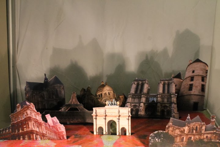
The next step is to print these images out A5 so that they aren't too big that they stick out the box too much. Also I feel if I make them all the same size observes can see the quality of my photos and also I can play around with sizing them physically by placing them close and far from the light source. Also I need to have a good base for the installation so using photos from the Rodin museum I will cut and stick them onto a sheet of A4 black card to make the base interesting as well as the rest of it.

Making a Mock-Up

Now I needed to investigate if this idea will work. I printed out my chosen image of Notre Dame at the same scale which all my images will be and began creating my mock-up.

Firstly on an A4 sheet in Photoshop I placed my chosen image of Notre Dame on half the page (so that is was A5 sized) and then printed it out and roughly cut the excess off the image. Before cutting it out I stuck it slightly above the edge of the paper so that there was room for a tab. At the bottom of the image I drew a line from the bottom of the building on either side diagonally to create a tab.
The next step was to cut it out. I cut it out carefully trying to stay as close to the building as possible. However, as this was a mock up it didn't need to be perfect but I didn't want to have too much wasted paper so tried to keep it close so that this wasn't a factor. Also once I cut it out using scissors I went back around the edges and trimmed any parts I had missed previously.
Then using a ruler I placed it along the bottom of the building and bended the tab over the line. Grabbing a scrap bit of black card I used pritt stick to glue the tab onto the black page. I then folded it more backwards to ensure it stood well and it did stand well alone. However, the bottom was clearly visible and the fact this is plain means it's boring and I feel I need something more on it.
I then grabbed a lamp and placed it on the floor however it didn't project well on the wall. So then I placed three scanners on top of one another and put my building cut out on the top. However the light being stationary on the floor meant that the base of the image was visible in the shadow which I don't want as I only want to focus on the shadow of the building. Therefore I physically grabbed the lamp and began pulling it closer to the image and further from the image. Also when I was experimenting with the light it meant I could see how having the lamp too close to the image made the photograph too bright that you couldn't see it well. As well as the effect of the shadow as the light was closer or further. Below are my experimental photographs which I took to show this.


From my model I learnt I will need to use a craft knife rather than scissors to get a close cut and even lines. As well as showing I need to think about where I will place my light as well as working on how I will place the objects in front of the light. Also it showed that the base where the objects it will need to have something on it so it is more interesting as at the moment it isn't.


Developing a Base

After creating my mock-up it taught my how I need to add a base to my piece. I want the base to be decorative and reflect both my themes of Paris and fairytales, therefore I will cover the A4 sized base in images from the Rodin museum and add images of clouds which are interesting to the top of it to look also like a landscape. To show off my Photoshop skills I will merge these photos together on Photoshop and place them over the top of each other using overlay and other tools and then print out the A4 sheet.
Below are the images I have selected to do this:
 

After I chose these images I opened it up on Photoshop and began merging them together to create my base.

Firstly I opened a blank A4 sheet on Photoshop and rotated it so it was landscape. As I wanted the cloud to be the main image I placed it on the page first. I then enlarged it so it took up the whole page.

I then took my two rose images and using the quick selection tool I cut the background from them then copied them over to the document. Using the overlay tool I made the roses semi see through so I could see the roses underneath. Then I enlarged them so they took up more of the image underneath.


Although I did like this idea to further it to link to the idea of being a landscape of Paris I scanned in a map of Paris from the trip (left). Opening it in Photoshop I copied the image over onto my base and then overlaid the map. (right) However with all three images layered over the top it's a bit too much so I have deleted the bottom layer.


Although I have deleted the bottom layer the effect it gave behind the roses looked nice so using the magic wand tool I selected each rose, inverted the selection and cutout the shape from the horizon image. I kept the overlay on the rose image then merged them together and re-overlayed them again onto of the map.


Once I had put this all together I felt it was a bit too much. So I enlarged just one of the roses to take up nearly the whole map and deleted the other rose. This however, looked like a red cloud over the map rather than a rose and I wanted the rose to be visible as it' a key fairytale theme.


I therefore went back to my original rose images and removed the horizon element. I then adjusted the opacity so that the map was still visible underneath the the roses.


As there was a large intersection where the roses over powered the map I selected the left rose and using the magic wand selected everything around it. After this I subverted it and then deleted it and made the other rose slightly bigger so that there wasn't a white dividing line. Also I used a overlay of Hard Light which allowed a interesting lighting effect on the roses.


Below is my final base:

Extra Exhibition Piece

As part of my exhibition I will have to display one grid displaying one of my personal collections. However, as I have two grids to chose from I have chosen my spotlight grid as I feel this one is stronger. Yet I didn't want to lose my fairy tale images so as I am using the building photos in my response I decided to create a small box which shows on each side a picture relating to fairy tales which I took in Paris. I will also have this as part of my exhibition. Below on the left is a template I found off http://www.mssscrafts.com/crafts/storybox/cube.htm and I will take this into a A4 Photoshop document and using my other images from my Fairy tale grid I will place them on the box sides and then physically cut this out and bend each side to build a small box. As I don't want to include any of my building images as they are being used for my response I am using the other 5 images and on the sixth side I will simply place the sentence "Paris is a fairy tale" so the observer understands why I have captured these images. I took the same images straight from my grid over so they were square to avoid cutting more and starting from scratch again.On the right is my box which I will print out then stick together using pritt stick.


After producing my plan I needed to build the box.
  1. I opened the box with pictures shown above and then using pritt stick stuck it onto a piece of white A4 card so it was more sturdy. 
  2. Then I used a craft knife and a cutting mat to cut the box out. I used a ruler to cut out the box template before using the rule to fold the edges and sides so that it was able to be put together into a box.
  3. Then using a pritt stick I glued the two tabs from the second square to the centre square and repeated this step. Before using pritt stick on the top tabs and sticking the roof of the box down. 
Below are my photographs of this step-by-step process:
Step 3: make and stick
Step 1: print and stick
Step 2: cut and fold

Printing and Making

In a previous post I discussed and selected my chosen 8 images and now I needed to print and cut them out. Firstly after my mock-up I found half A4 was a good size however I didn't want to ruin the dimensions of certain images so just enlarged them so they were the same width as A4 but not the same length as A5. From this I printed the images out then stuck them onto card. Using scissors I cut out the buildings. Below is how they looked once they had been cut out from the black background.

I captured these images on a camera phone so the quality is poor but it still shows clearly what I have done. However as you can see these are not all my images as some of the images were more intricate I needed to use a craft knife to cut closer and cleaner to the edges and a cork tile to avoid scratching any surfaces. Below are the images I conducted this method with:


The Eiffel Tower image was different as it needed to be cut a certain way to showcase the full Eiffel Tower so when it was projected as a shadow on the wall it's instantly recognizable. Firstly as with the two images above I cut out the image using the craft knife. Then I cut out the intersection of the tower so that it has a gap in the center. After this I used a ruler to fold the tab line over and then drew a line using a gold pen so it was obvious on the page to mark two points in which I will cut along. The next part was to cut a section off the bottom along the edge of the image so when the light shone through it the image allowed to show clearly the outline of the Eiffel Tower.

Experimentation and Choosing a Space

On my original plan, the next few steps were:
6.  Cut the back and front of a shoe box off and then cut out images into the box carefully
7. Use tape to stick them down as more secure than glue - but don't stick them down till I definitely know where to put them.
8. Place a light in front of the box and shine through to test if the shadow effect will work - place a bit of white paper on a wall as this is what I will shine the shadow landscape onto in my exhibition.

I changed this plan slightly as I felt it was difficult to conduct these steps without proper experimentation, so below is my experimentation development based around the above three steps.

However, as I made my photographs A5 once I had them all cut out in front of me I felt having them placed in a shoe box would mean they were crammed together and some parts wouldn't be seen. Therefore I printed out my 'base' image A4 and then stuck it onto A4 black card, using white tac I stuck down the objects (I used white tac as it meant I didn't have to put anything down permanently. However, this was a small space to place all my objects on and they didn't fit well as I only managed to get 4 images on the page. Therefore I will use a A3 sized base instead. Using this model that I had made I decided to place it once again under a table and place a light behind to see the shadow. The piece needed to be placed on a table of some sort to make it taller, however it was too tall being placed underneath a table and onto of a table. From this I decided in future I need to use a open space so there is room to see the shadows behind. I documented this process with photographs, please see below.

I used tac to stick the
images onto the A4 base.

I only managed to fit 4 images on the page
Below are the experimental shots I took with the objects placed under the table:


From the mock-up above I found I needed to use a larger base, therefore I re-printed the base image A3 size (this is the largest type of printing the school printers are capable of) and stuck in onto sugar paper to make it more sturdy (card would have been better however, I couldn't access this and as it will be placed on a hard flat surface I didn't worry too much.) Then began placing the objects onto the A3 sized base. From this I wanted to change the angle so I could fit more onto the base and more would be visible once you shone a light through it. Placing the smallest objects at the front and the tallest at the back I began once again using white tac to order the photographs. I still found I couldn't place all the photographs onto an A3 base successfully so I will flip the original base image and re-print it A3 so each side looks at each other and they work as a reflection. Using the images stuck onto the A3 sheet I placed it in front of the green screen to experiment with the shadow in a open space and found it didn't work well against a dark surface. I then placed a white A3 sheet in front of the green screen and you could see the shadows more. Also I worked with two lamps on the experiment rather than the one so it gave two angles of the shadow. I documented this process with photographs, please see below.

I placed 5 objects on an angle on the A3 page
I experimented with the green screen and
it didn't work very well.


I experimented with making a shadow effect by placing an A3 sheet of white card in front of the green screen:


From my original research piece Shadow Play (Paris) by Hans-Peter Feldman the artist placed the objects close to the spotlight but the table they were placed on far from the wall. When I go into my space to put the installation together I will adopt this idea and practice with this. Also I will work with a white sheet and place it on the wall from the shadow to be reflected onto. Firstly, I needed to see where I will put my installation. The exhibition is being conducted in the school library so I went in there and with my camera phone took photographs of the area and decided where I would place my exhibition.


This space seemed good as it was around a corner so would be in a dark space which would allow the viewer to be sectioned off from the rest of the exhibition to see my piece. However, it is hidden slightly and I feel unless you knew it was there it would be over looked.


This space is a separate room within the library where the event is taking place. I would of liked to of used this space however it was unable to be used at the time of the exhibition. Also like the one above I feel people may have overlooked it as someone may close the door by accident then no-one will see it.

I chose this work space because it meant as soon as people walked it in caught their eye. Also it was a dark corner which meant that the shadows would look effective here. I do need to experiment with the space soon as I need to work with the natural lighting in the space to decide on where to put the lamps. As well as how to place the white background sheet on the wall so that it hangs well - I will probably use drawing pins or place the sheet underneath the top layer of books on the shelf. The image below depicts where I will place things, it is a rough digital sketch I did on Photoshop. I used the paint brush tool to draw the objects then colour co-ordinated them so it was easy to see. I also placed a key around the edges to explain what was happening.


Another key part of building my exhibition is to pick a background sheet so I scanned the art cupboards and picked three pieces which I feel could work below are the three choices:

This is a satin sheet which has a shine finish which I fear may distract from the shadow. Also it isn't technically square so it may not be big enough to cover the bookshelf like I planned to. As well as this it is not white more cream however this could be more interesting than a plain white.
This sheet is slightly smaller however it is square so no fear of having to try and fit all the shadows onto the rectangular shaped sheet. Also it has a nice finish on it as it's not soft or silky which makes it more interesting. However the size is a problem and it may not take up enough room and the bookshelf may be very visible which could distract attention from my work.
This is far larger than the other two and the yellow pops and instantly grabs attention. A main problem is the fact it is longer than wider which means it'll either take up the whole bookcase going lengthways or take up a section of it having it downward. Also as it is old it does have some marks on it including chewing gum which could ruin my piece. It could work well at hiding the bookcase if I was to carefully position it so it was lengthways.


The next step is to go into my area and pin up the sheets and see which work best then position my photographs on a table and work out where to place the lighting. Also I need to re-print my A3 sheet base and stick the two bases together so they look as though they mirror each other. After this I will need to work on how to position the photographs so it creates an interesting landscape shadow when placed in the exhibition.

Experimenting

Before I embarked on my final steps to create my installation I wanted to do some more experimentation. I fell this is important as I want my installation to be successful so I need to ensure I have done everything to make this possible. I decided that as my background was going to be white I wanted the table the objects were placed on to contrast with this. Also the table had marks on it which drew attention away from the piece so to have a clean table I placed a black sheet of material over the top. Then to check that it won't affect my work I placed the base for my piece on top and found it still fit and looked good so kept it this way during my experimentation process.

Placed a black sheet over the table
Placed the base on the table


Next I needed to place my objects on the base to work out how the shadows will look. I decided to put the taller objects at the back and the smaller ones at the front. As I wasn't sure if this would be perfect I only stuck the photographs on using white tac (as I have done previously) as it comes off quickly and easily. I couldn't see if this was a good set up until I had started beaming the light onto it and seen if it worked. This was the next step I took. Below are photographs of my experimentation with lights. With some I used one light and with others I used two.


I found using one light gave a sharper shadow and a darker image, however the two lights gave a ghostly feel which I quite liked. Also when the ceiling lights were switched off it worked better as the light from the lamps was able to be more direct and powerful. However all this experimentation was done on a small table and I feel I would need to have a taller table for it too looked good. So as pictured on the left, I got a new taller table and covered it, much like before, with a sheet of black material. I then again moved the photographs over but once I had moved them some were flopping over, this was due in part to the chosen glue I had when sticking the images onto the card. As well as the fact the card wasn't very strong, but they weren't stuck down securely either. However I did worry this could effect my final piece so using a glue gun I stuck a stand behind my photographs. I got a sheet of black mount board and cut strips from it using a craft knife, cutting mat and ruler. I then cut two fold lines and stuck a end of each strip to the photograph. They stood better now but still needed to be more secure however this couldn't happen till I decide to permanently stick them down.
    Using a glue gun, craft knife, cutting mat and
    mount board I create stands for the photos.
    I created a stand for all the photographs and stuck this
    onto the back of every photograph using a glue gun

    Putting it all Together

    As I was creating an installation it meant I needed to put it all together in my space. In a previous post I explained where I will place my installation and how I will arrange the area to accommodate with this. So firstly I moved everything out the way, this was important as it meant I could work without any distractions or obstructions. I then wanted the shadows to be projected onto a white sheet rather than the books so covered this back wall with a large white sheet. This wasn't one of the original three I looked at using however I found this just before I began putting my installation together and felt it worked well as it was larger and white with no pattern. I then brought my taller table down and stuck the black sheet of material on top using gaffa tape I wrapped the sheet at the back around the table top and stuck it in place. Then I started bringing it all together by working with the lamps and the buildings.

      I covered the back with a white sheet
      I brought all my  items together and began putting it in place

      Just before I began sticking anything down permanently I had a last minute change of place. I moved from the bookshelf's to a corner unit within the exhibition which had been set up specially for installations. So therefore I moved my white sheet over to this unit and using gaffa tape stuck it on the back to the boards in the installation. I used the same table as before and simply moved it to the appropriate place which allowed it to be more enclosed and darker.   


      I decided the table was good as it was tall so the piece was at a height but having the lamps on the floor meant they didn't reach the photographs well so the shadows didn't look as good. Therefore using the original small table I brought it down and placed it in front of the other table. I covered the small table with the same black material and placed two lamps on the top and shone them in the same direction with the heads titled. 


      The next step was to organize and place the objects on the base. For this I used white tac and sellotape. From my previous mock-ups I found placing the taller objects at the back and the smaller ones at the front worked well so I did this. I used sellotape to stick them in place, however before I did them all I stuck some up checked the lighting if I liked it. Then keeping the lights on to make sure everything looked good I placed them on there permanently. The next step was to experiment with the lighting. As I had decided where everything was going and stuck it all down with sellotape as it was more secure than glue and white tac. Below are my images of experimenting with light.


      Experiment 2
      Experiment 1


      After doing this I felt the piece was too low and as there wasn't much height from the shadow I needed to place it on a taller table. This was unable as there were no taller tables which I could find, however we did have podiums. I used the middle sized podium as it wasn't too tall and also it had rectangle base whereas the other two had square bases. I then had to place the lights on the taller table so they were a good height. I wanted to experiment again with the lights. Below are two experimental photographs.
      Experimentation 2
      Experimentation 1


      The two sides of the installation were the blue boards and this absorbed the light due to being a darker colour. Therefore I decided they needed to be covered in a lighter colour so it reflected the light showing the shadow on the sides. Therefore I place beige coloured A1 sheets on the walls and stuck them on with masking tape. This made it look unfinished however and rather poor quality. Also the effect of the shadows on the sheet looks better than on the paper. Due to this I will add sheets on either side to make it look better. The image on the left shows how it looks with the A1 sheets.


        As my installation is seperate from my other pieces I will take interesting photographs of the installation and place them on black mount board and stick them with my other work so people understand the link.

        Final Response

        As my response was an installation I couldn't place it on the blog very easily so I photographed it. I will take more photographs before I take it down and during the exhibition. Also as I stated in a previous blog post I felt having my installation apart from my other work meant people didn't know it was mine so I will place three photographs of the installation alongside my other work.

        When I logged onto my blogger account I found a Google Alert in which I was told a Google+ Auto Awesome photo was added and when I clicked the link I found a GIF of my photographs (shown below) and felt it was very interesting. I'm unsure of how it was created but like the concept and feel I could use this idea of GIFs possibly in a future final piece.


        Below are images I captured of my installations, I will place three of these next to my other exhibition pieces, some of these photographs feature in the clip above.

        This image has far too much in the background and it shows the lamps which I don't want to be a key feature in the piece. Also you can see the background clearly and I wasn't very happy with the use of beige paper and white sheets so I will change this. However it does show my work clearly and captures all of the shadows.
        This photograph is fuzzy which makes it poor quality, it is also shot from a low angle which means the bottom blue boards are visible, this can obstruct the view. It is also taken from a slight angle which means the shadows on the left wall are lost also as it is slightly zoomed in the other side shadows are lost.
        Although you can't see the sides in this image I do prefer it being close up as you see the quality of the images. This is key concept within my piece as the photography element is just as important as the shadows. However in the bottom right corner is the top of the black lamp and this draws attention from the piece within the photograph.
        Much like the photograph above this image works well as it is zoomed in, although this image isn't as zoomed in so you can see a hint of the side shadows. On the other hand the right bottom corner does show a hint of the lamp which shouldn't be in the image. As well as the left hand side not looking as good as it does which makes my installation look poor which isn't the case.
        This doesn't have any parts of the lamp within it. Also it is a high quality image, it shows how the light hits the photographs through the reflection from the photos. It displays the photographs that I chose well and the shadow looks good behind it.
        In the bottom left corner you can slightly see the lamp however as it is so small if I was to use this I could content-aware that to remove it. It does show the tall tower at the back to be falling over (this is a problem which I plan to rectify by using gaffa tape at the back as it's stronger to stick it down better). It also shows the sides of the shadows.
        This is my favourite of all the photographs as it is central and shows my work off well. It does show the sides to be beige paper and in my actual exhibition this won't be the case, but this will show the viewer my development.


        This image is slightly poor quality and the shadows don't look as defined as they do in other photographs. Also the bottom of the board is shown and this makes it look poor. Also the images look very dark as the camera is capturing it from a distance which wouldn't of been the case when a viewer observes it in person.
        From the photographs above the three I have chosen to present in exhibition alongside my final piece is:


        As the other piece on my board is an A2 sheet of black card which displays my grid, number, photograph of myself and best photograph I will place these images on a A2 sheet of black card so they link. The way I will display this is shown in the diagram on the left. I will edit the photograph before placing them on the A2 sheet. Just before I place them I will print of the best one A4 and the other two just slightly smaller (I will use rulers to work this out) as A5 is too small and I want them to be smaller than A4 so the best image stands out.


        Adding an Extra Part

        I decided my concept may be slightly unclear so I decided to add an illustration of a girl walking in Paris to show people this is what my piece is all about. I also wanted to show off my illustration skills as the installation and exhibition focuses more on my photographic skills.


        Firstly I chose this image of Holly walking through Paris. Its good as she's looking over her shoulder as if she is looking at the viewer of my piece inviting them to join her. Also she has a slight smile on her face and this seems childlike and sweet. I took this image into illustrator and began working on it.


        On a new blank layer I drew over the outside shape of her using 0.5 brush stroke and a dry brush. I did this so the outline was bold but also I prefer the sketch effect over the straight lines as it looks more childish.Then I began to draw in the detail, using the same dry brush and a brush stroke of 0.5 again I added in sections. I did the main parts, her separate legs, trainers, bag, camera, jumper and neck. This meant it showed her different parts of the image and separated her body from her possessions. The next step was to add in more precise sections, I used the dry brush again but this time a stroke of 0.2. This meant the detail wasn't as bold so looked different. I added in the line on the bottom of the shoe, the arm, detailing on the camera, the face and hair line and detailing on the jeans. Using a smaller brush again I added in the crease lines, this made it more realistic and gave it a better look. The dry brush and stroke of 0.05 was used to do this. I added in creases on the jeans and the top and some more detailing on the camera. At all times I kept the image illuminated underneath so I drew over the actual crease lines making it more realistic. The final section of drawing was to add the facial features. I decided not to use any stroke lines on the hair as that can make it look bad. However I did add the pupil of the eye and the eyebrow and lips. I didn't separate the lips and in the image you can't see a separation in the lips. I did however turn her face into a faint smile which made it look more inviting. Below is how it looked before I added colour:
        Adding colour brings the piece to life, I faked the colours ever so slightly so it didn't look exactly like the girl in the photograph. To add colour to the image I opened a new layer and placed it underneath the drawing layers. I then used the pen tool to mark around the shoes and added the colour. I did this to every section. Underneath is how it looked in illustrator with colour: 


        I wanted it to be more obvious what the point of my installation was so taking it into Photoshop I enlarged the image so it was A4. I then added a quotation from Alice in Wonderland. I did this to in keep with my fairytale theme but also the quote "Just go where your high top sneakers sneak, and don't forget to use your head" I felt summed up my trip to Paris well as this is exactly what we did.

        Below is the final piece, I will stick it onto the black material which covers the taller podium which has my final piece on the top.

        Photographs of my Installation

        Previously I discussed how I wanted to add another A2 sheet onto my board which displays my final installation. However the photographs I took were taken before I made some final additional changes, therefore I needed to re-take them. Below are the image I re-took:


        From these images I chose the two displayed below. I decided only to use two in the end as I didn't like the photographs I captured very much and will re-take them. Also I felt realistically only two of these were very good. Additionally having one landscape and one portrait meant they could be placed nicely next to each other (as shown on the left). The bottom box will display a small message asking people to view my installation around the corner. After the installation with a better camera I will take better photographs of the piece and try to arrange the lamps in such a way that they don't obstruct the photograph. This has annoyed me slightly as the installation doesn't photograph as well as I hoped and I need photographs to document it. I edited the two photographs and explained how I edited them, please see below:
        First chosen image, I started by taking this photograph into Photoshop to edit it correctly.


        The first step was to straighten the image, using ruler I created a line across the base and the side of the podium which I will try and align correctly. Using the marquee tool to select the image I pressed SHIFT and T to resize it and then held CMD to realign it dragging the corners. The second stage was to adjust the levels, as this was just to show people that the installation was made by me I didn't worry too much about capturing a perfect photograph as I will do this after the exhibition. Therefore I simply adjusted the levels slightly making the edges darker however due to the photograph being glossy the light reflected straight off the lighter images. This meant they looked odd compared to the other parts of the photograph. Finally I slightly edited the curves. After adjusting the levels I felt I didn't need to worry about the curves too much so just mended then ever so slightly to make the shadows slightly darker
        Below is my final photograph:


        This was one of my favourite images as it showed contrasts in light. I edited this in Photoshop.

        I decided to adjust the curves firstly as sometimes this gives a better effect than just changing the levels. It made the image darker in parts and lighter in other but simply enhanced the natural lighting within the photograph. Once I had adjusted the levels I felt it was complete and as I didn't have much time left I needed to get the pieces printed off and stuck down onto the board. This meant I had to rush ever so slightly so I decided to print it off as it was.
        Below is my final photograph:


        Evaluation

        I feel the Paris art show was a success for me. However there were a few things I need to work on further. Below I have created a plan for how to evaluate my work from the Paris show.
          • Include written analysis of Paris work
          • Photographs of my work in the exhibition - boards and installation
          • How I changed it last minute with the sheets
          • Think about the following when writing it:
            • what is it about? Discuss: process, form, content and mood.
            • How have I developed my idea so far?
            • What will I do next and how will I get to my next stage?
        Evaluation Write Up
        For the Paris exhibition I created a light based installation which displayed key buildings I saw in Paris and then reflected them onto a white sheet and showed a shadow landscape of by perfect Paris. I included eight pictures in total, four buildings which architecture and structure reflected my ideas of fairy tales and four which were iconic buildings in Paris: Notre-Dame, Eiffel Tower, Montmatre Sacre-Coeur and Archtriumph. I decided to do this as a key part of the Paris trip was walking as we walked everywhere to see the tremendous landscape, therefore my piece was based on this concept. To convey this throughly I stuck the images onto a base which consisted of a map of Paris with four roses overlaid (roses are a key concept in fairy tales and I wanted to in keep this idea of fairy tales throughout my work) and added an illustration of a girl walking and looking over her shoulder with a quotation from Alice in Wonderland stating "just go where your high to sneakers sneak, and don't forget to use your head". The main reason I used a quotation from Alice in Wonderland was because a key theme of this story is the concept of walking unsure of where you are going which is basically what my trip to Paris was all about for me. 

        As well as creating my shadow/light based installation I had a board which displayed my other work. This included my fairy tale box, in which I displayed images which reflect the idea of fairy tales which I captured in Paris. Alongside this I had a grid which as based on spotlight in which I showed 9 images in a 3x3 square grid showing key photographs I captured in Paris which are based around the idea of spotlights. As well as a best photograph which was of a part of the Eiffel Tower in which a beautiful horizon was displayed behind the Eiffel Tower as the sun was beginning to set behind the clouds. Additionally I had a photograph of myself which was captured in front of the Eiffel Tower and focused of the miniature Eiffel Tower earring I was wearing. 

        My response worked well in that I took a risk and it paid off, previously I had never done an installation  and I did fear it wouldn't of worked as well as a photograph however it did and I received an award for most improved which helped bump my confidence. The response conveyed my two key themes for the exhibition well - Paris and fairy tales - as well as reflecting the work of on of my artists Lotte Reiniger who creates short shadow films by using stop motion. The space I was allocated allowed the viewer to become solely emerged in my work and focus on the concept I was trying to convey. Also the fact it was hidden in a dark corner meant the shadow once projected onto the white sheets were bold and bright which meant they clearly showed my Parisian landscape.

        Although the space I had allocated was good the external lighting was bright which meant my work did have other factors which became an issue. Also the sheets were stuck on the boards with gaffa tape and by the time of the exhibition they had fallen and the gaffa tape was visible which reduced the quality of my work. As well as this the taller building at the back continuously fell down so was stuck with many different types of tape which looked scruffy.

        Previously my final responses which reflected the theme of fairy tales were all photographic or illustrated therefore this response explored a new media which was far more interesting - I felt. Also I have focused more on buildings whereas previously I had a strong focus on women and how females are presented in fairy tale artwork. I do want to return to this but it is interesting to see what other ways fairy tales could be conveyed within the everyday world around us.

        Although I did enjoy creating an installation and exploring a new way of displaying a final response I do feel I want to go back to focusing on photographic responses. Many of my inspirational artists displayed in my personal study are photographers and I feel by focusing on creating photographic responses I can look into capturing beautiful moments in a stunning and simple method. The main artist which influenced me into following the idea of fairy tales was Annie Leibovitz an American editorial photographer. I will look at her in detail once again and the chapter I wrote on her and explore the prospect of creating a photographic response to her work.


        No comments:

        Post a Comment